(Archive) Advertising District / Dump-Place
-
 19-April 07
-

 Cocoa
Offline
I like the round window, enigma. really gives it a unique, whimsical look. the surroundings could do with work though, they seem pretty bare and boring
 -

TwistedHelix Offline
Love the NCS work Enigma and Nin but I've got to echo what others have said regarding your foliage enigma in the last screen.
Now given that I tend to overload on foliage as I prefer the full overgrown look to my work (screw space who the hell needs that in a theme park?) but the banks of the rapid just seem boring without more foliage close to them. I mean you may have been going for a open look where guests could watch the ride but that still doesn't stop you from adding low foliage to the banks.
Nin I love the stadium but not sure on the toadstool umbrellas. I know I've yet to find another way of doing umbrellas NCS, but they just don't fit there in my opinion. The rest is lovely though.
Hope at least some of that made sense.
Cheers
TwistedHelix -

 Fizzix
Offline
Figured I'd contribute.
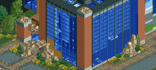
The Family Recreation Center provides two rock climbing walls, a giant sandbox, and a pool complex for all of your family's entertainment needs. Be sure to check out the Rock Climb Cafe tucked behind the climbing walls! -

 Cocoa
Offline
nah the ruins look perfect for a sort of artificial rock thing. I can totally imagine that.
 -

 Ling
Offline
I don't really know what you're trying to do with that element in the middle of the ride, but it looks dreadful. B&M wing coasters generally tend to be as wide and "swoopy" as possible, so tight inversions and turns like that really don't work. A large loop or simply another zero-G roll would probably fit better there, since you already have a kind of pitched overbank there.
 -

 dawidox
Offline
Thanks Ling. I wasn't happy with the Layout myself, I just couldn't point what it was lacking. Your point and some other ideas that came to my mind, after reading your answer and after I took another look at the Layout, I'll rebuild it almost completely. I'll post the results in the next time...
Auf Wiedersehen -

 dawidox
Offline
But that layout is based off a real wing rider...
That's true. I tried to rebuild the New Heide Park Wing Coaster, BUT that's not easy, not to say impossible with the Limitations of RCT2. That's why I'll try to go with an interpretation... -

 posix
Offline
Screens aren't enough though, unfortunately. We need some good NCSO releases to inspire people and put an end to the CSO madness that wastes away players. The last couple of NCSO screens in this topic is where the game should have been taken ages ago, but sadly never was.
 -

 disneylandian192
Offline
Screens aren't enough though, unfortunately. We need some good NCSO releases to inspire people and put an end to the CSO madness that wastes away players. The last couple of NCSO screens in this topic is where the game should have been taken ages ago, but sadly never was.
I definitely agree with you posix. I think the level NCSO has reached could only have really been achieved with the help of the extreme detailism movement. Detail has become how quality is judged by most these days, most of the time ahead of even atmosphere and aesthetic quality. Without hyper-detailism, we might have never had the need to push ourselves in the NCSO medium. One could look at it as detail is the disease and quality NCSO is the cure. Alexander Fleming needed WWI to discover penicillin. NE needed detail to discover quality NCSO. -

TwistedHelix Offline
^ and ^^ I do agree with you both as I think that's why I dry up so quickly with the drive to work on parks using CS rather than parks which are NCSO. Using CS I always feel the need to try and detail it as much as possible and I think it wears me down to quickly. With NCSO however I know there's a limit to the amount of detail that I can put into a screen so it doesn't seem to eat into the drive to build.
I do say that on the other hand though some of the older parks with CS are amazing. I think whats dried up NE so much over the last few years is the departure from fantasy into realism. Now don't get me wrong realism is fine but there's only so much you can do until it isn't realism anymore. The trouble I think with parks that are realistic now days is that everything has been done before to some degree, and although technically the parks being released are great and really well done, it just doesn't have that spark that makes me want to spend ages sifting through it like a good old Kumba(fantasy based)or Jkay park does.
Cheers
TwistedHelix -

 tyandor
Offline
It's true that detail can distract you from the overall picture. The thing is most people start too much with the detailing. I personally prefer CSO simply because it allows me to do things NCSO doesn't. It's as simple as that. But those are merely the tools. NSCO forces people to think more about more general qualities they seem to forget when they start with just the detailing. The reason for this is because of a lot of NSCO looking like crap per default if you try to detail with it. You are forced to use the basics more, the basics a lot people from the later generation might have skipped. The basics being colors, composition, atmosphere, etc. Learn to love 'm because these are the best tools you can have.
Case and point, below a screen of some very early rct2 work from yours truly, the entrance of EG: Shady Oasis. Most people won't know it and the reason I chose this example is because I obviously know it very well (well duhh ).
).
This was built with a NSCO bench (if you ignore that I made the jungle plants stack-able). It's one the first things I built in rct2 and still one of the best thing I've built in my opinion. When I started this detail wasn't on my mind. It was more of after thought than anything. I still like this because I envisioned how grand that entrance would be from the guest's point of view. To feel the atmosphere that draws you in. I thought about color, atmosphere, shapes, layout and most important I had a goal with it. While I still do this, it has become harder to replicate this personal success, because it's easy to lose your focus, especially if you get swarmed with options (and I'm a chaotic person in general). I can make this screen better with CSO and take it to a new level, but that wouldn't be possible before you get the base for it done. Any detailing after that is just icing on the cake, not the ultimate goal.
Tyandor out -

TwistedHelix Offline
Holy shit 0.0 Seriously that's got to be one of the best screens I've seen in frigging ages.
Lovely screen Tyrandor.
Cheers
 Tags
Tags
- No Tags


