(Archive) Advertising District / Dump-Place
-
 19-April 07
-

 disneylandian192
Offline
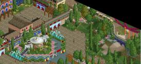
gijssie: thats looking great! Its nice to see you delve into a little more color. The layout has good flow, albeit the inversion order is unconventional, but if the pacing is there than no complaints! LOVE that building with the green railing just to the left of the cobra.
 -

 Insanity
Offline
I haven't seen anything for Busch Gardens Asia in ages, let alone a Jagganath screen.
Edit: disneylandian, The screen is from Robbie. -
 Doomblade
Offline
@ WhosLeon: thanks, glad you like it!
@ Fizzix: Thanks too, I've been thinking about how to improve those corners for a while, I'll try the wagon-wheel thing this time! -

 csw
Offline
Doomblade - the path seems a bit too wide, or needs something to break it up. I think adding path accessories would add some life to the screen as well.
 -

 gijssie1234
Offline
People browsing on auto-pilot. "Look at the pretty colors!" (What he says
He even wrote 'how is this park doing' underneath (and
(and
Has no one seen BGA? That is Robbie's work. (and
Posted Image
The colors are not the only thing on a park that has to be fine, if you see a real theme/amusement park you will see there are not always bright colors over the area.
Also the details are important, The way robb build his parks are such great in every detail, really everyone can learn from how he builds! so thats why i'm asking , did anybody now the status of this park? -

 Doomblade
Offline
Fisch that screen is very nice! I love the symmetry in that railway-merry-go-round construction! But what part of it is actually called the "Texas Giant"?
And @csw: The path here is only this wide because this is right in front of the park-entrance, I thought it needed sort of an open look. -

 Jonny93
Offline
Great to see some new work from you Fisch. The atmosphere is really good and the screen is full of fun.
 -

 wheres_walto
Offline
I dig that, it's like a flashback to the parks right when I was starting up playing
 Tags
Tags
- No Tags


