(Archive) Advertising District / Dump-Place
-
 19-April 07
-

 Lloyd
Offline
There's no problem with the scale, it's all proportionate.
It looks really good, well done. -

 ClockworkMyr
Offline
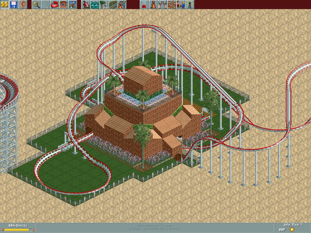
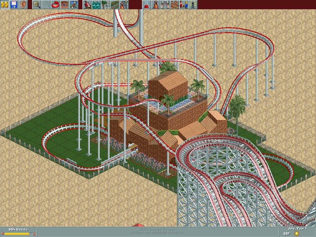
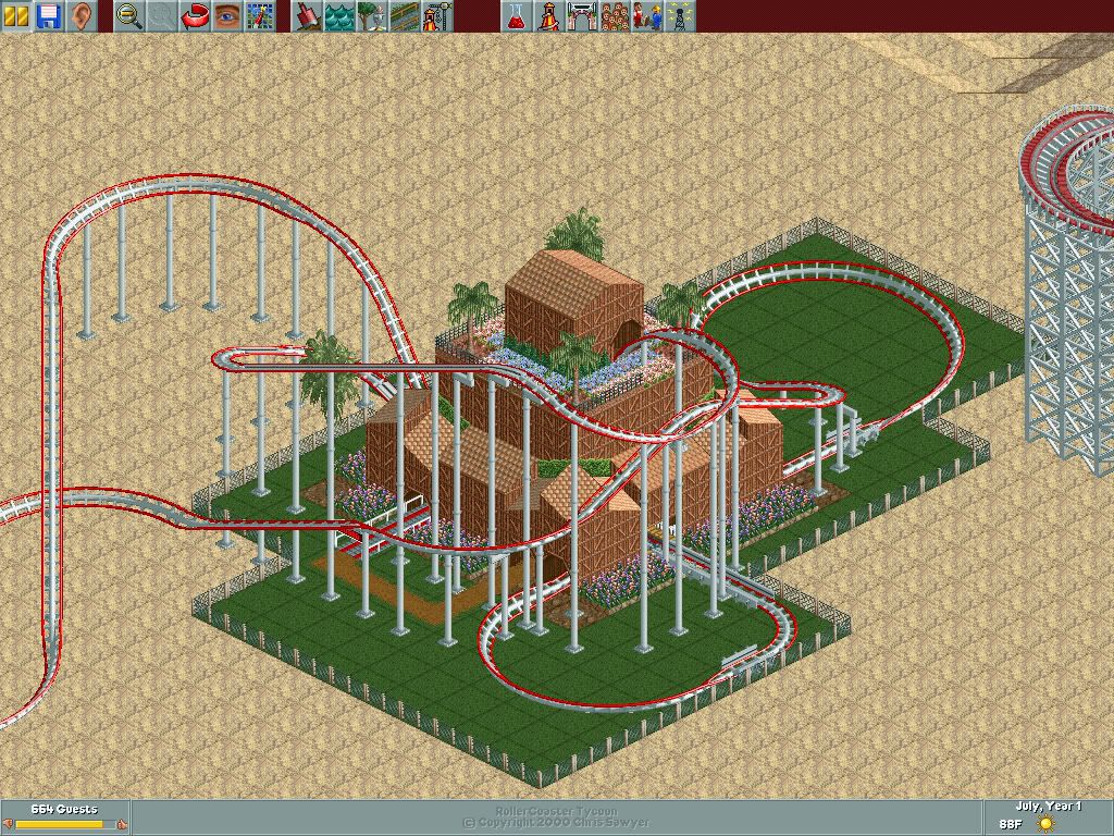
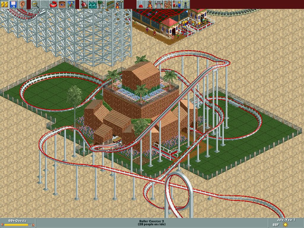
I was experimenting in RCT1 and made my first ever building. This is my first and I can't hack since it's RCTDeluxe, so meh.


Made in the Arid Heights scenario. Coaster is called Fireball. There's more vegetation around it, but I was too lazy to make more screenshots and convert them from PCX to JPG. So here's the entire park itself.
http://www.box.net/shared/8hzm6zogkc
-

 Wolfman
Offline
Sorry to interrupt folks. But I thought I'd post a few images of "Gargoyle" a Dive Machine.
 -

 Bender
Offline
Inspired by the Gargoyles-Series? Best Cartoon ever :-D
Looks nice overall, but i don't like the stonewall. And on the last screen there is this empty wall with just windows. Maybe place some balconies or jutties (right word? i don't know, lol) here to fill this emptieness. -

 Sulakke
Offline
@nin: It's ok. Maybe a bit too busy, but it's still nice.
@Wolfman: I don't like it at all. There are way too many textures and it's just too much pain to the head to look at it and figure out what the buildings are. -

 gir
Offline
ClockworkMyr: Keep it up, you can still do a lot without hacking. The building is a bit unorthodox but it's promising.
-

 Wolfman
Offline
Inspired by the Gargoyles-Series? Best Cartoon ever :-D
Looks nice overall, but i don't like the stonewall. And on the last screen there is this empty wall with just windows. Maybe place some balconies or jutties (right word? i don't know, lol) here to fill this emptieness.
While I won't disagree about the animated series, (I liked it too,) the coaster wasn't inspired by it. It was inspired by Busch Gardens, Tampa: Shei Kra, and Busch Gardens, Williamsburg: Griffon. I thought I'd beat them to the name "Gargoyle". Like that would ever happen.
True. With a humongusly tall wall and at this point in construction, I was running out of ideas that I hadn't used before. Vines can only grow so tall, right? But I like the balcony idea, from Bender. Thank you.
Sulakke:
Yeah, I was faced with that tower, so that the drops would act something of a ledge or perch for the "Gargoyles" to drop from. So, it had to be obnoxiously tall. The stations structures were made, then the track out on the circuit was just so bare, I had to do something to continue the theme out at the drops. With so much "curve" to build around the lower levels, the addition of any "connecting structure" just made the construction more complex. I guess a builder can't satisfy everyone. I'm sorry that you don't like it.
But, I noticed the "blending into each other". But since it was a compo entry that never got "compoed", I figured, what's there to loose? Besides, aren't the buildings to the same attraction like this, supposed to be like... the same? Anyway, I'll keep that in mind, (Note to self: Try not to make things too "busy".) Thanks for that tip, Sulakke.
And ClockworkMyr:
I like the track layout. But it looks to me that there may be a lot of speed before the first brake. I'd take advantage of that with another virtical loop. Or cut back the height of the lift hill, so you can run trains slower before the first brake. That way, you're not spending the extra bucks on slowing down the trains.
How did you get the perpendicular track past the station inside? If it's just a single level "hop" over the station, you may want to pull out of that last drop at a level that allows the track to clear the station. Hide a few brakes inside the strucure to do MOST of the slowing "secretively".
You can then make a helix once you get past the station, and drop down to the same level that the station is. A combination of wide turns, the helix and wide turns after the helix would allow a 540 deg. curve, that'll get the trains leave in the same direction that they entered. Just like a 180 deg. curve. If just a tile or two wider.
One other thing is where the tracks come down to a level banked curve, you might want to level out to flat, then bank into a curve. I discovered that by using two sections of track to do this sort of maneuver will cut back the nausea significanly IF used consistantly. Rather than one section flatening out AND banking into a curve.
The structure looks alright for RCT 1, but the rooftop flowers, trees and hedges, don't. I'd place the hedges between the flower beds and the structure, and maybe around the tall palms at the corners.. Maybe replace just a few flower beds with some trees, to get more green, up high, against the structure. I think you were trying to get some color up there, if you ask me. Using the red Marsian texture to act like "red tree bark mulch" around the trees might help out too.
Oh, and try to accent the paths by changing the surface texture beneath the paths. This adds a nice bit of detail to the path. The fence surrounding the coaster looks a bit too "industrial", try something that is more in line with the theme. All in all, not half bad.Edited by Wolfman, 30 June 2008 - 10:35 AM.
-

 Sulakke
Offline
Yeah, I guess it's just not my style, but I'm sure there are people who love your work.
Btw, you did show us screens of that coaster earlier, didn't you?Edited by Sulakke, 30 June 2008 - 10:50 AM.
-

 Wolfman
Offline
I think I did. You have a good memory! It focused on the entire park, not just one attraction.
But the topic got shut down because it wasn't "user-friendly". Things got outta hand. I blame myself. But I primarily wanted to focus just on this coaster and structure. Mainly because I really made an attempt at a fancy castle just for this track. Sort of spreading my structure design wings and do something a bit more complex than my usual.
I also wanted to open up the saved game, and do a little more work on it. Maybe try to make some custom supports, just to improve what I have. Good GOOD input thus far. I'm happy with the outcome.
This time.
-

 ClockworkMyr
Offline
Alright, thanks for the information Wolfman!
 I was just going for something compact, and also was going for some realism and a more tropical approach. There's really no need to cut back on nausea, it was 2.23 for that coaster with high intensity and excitement. I was considering using the tarmac or dirt, but went with dirt. Another thing I was going for on the building was sort of an inn feel with flowers on top. But thanks for the advice again.
-

 Lloyd
Offline
I'm not sure you need the three black deco stripes, but i can't fault that, man, it looks brilliant.
 -

 FK+Coastermind
Offline
i like the deco stripes. id say that simplicity of a few textures on the top of the buildings walls, set off by the black stripes is Brilliant. reminds me alot of Siren by J K. maybe try to keep the buildings less extremly texturized. my only problem with your work right now is that, it always seems like you have 20 different textures and archy types in each screen. it works if your trying to make a realistic city or town, but it looks alittle odd in this screen that is from a theme Park setting. other then that, i like the colors, they make a great atmosphere. no argument with the foliage except the flowers at the bottom looks odd. nitt-picky things, change the color on the top of the tiny deco blocks that are vents, to grey so they dont blend with the rest of the roof. also, i would say take out of choose some other substitute for the wooden beams around the benches. they dont work IMO. maybe just some deco pieces. last thing would be, see if you can make the door bigger, it seems kinda small for an entrance to an eating area. other then those small things, great looking screen!
FK -

 lucas92
Offline
I would remove any art-deco pieces on the buildings. Art-deco generally make the buildings looks too much forced. Simplicity is always better.
 Tags
Tags
- No Tags


