(Archive) Advertising District / Dump-Place
-
 19-April 07
-

 csw
Offline
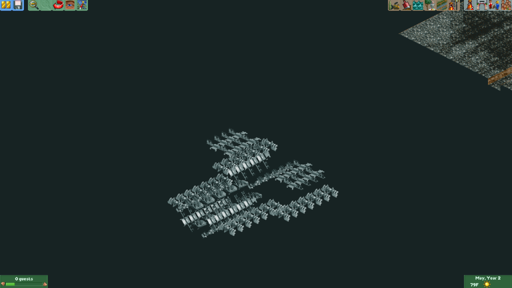
Architecture is fantastic, but the whole screen feels a bit washed out. Perhaps it's the paths.
 -

 ScOtLaNdS_FiNeSt
Offline
If its in space tho CSW, It doesn't need to be.... you know because there is no gravity in space...
 -

 ScOtLaNdS_FiNeSt
Offline
Who's to say the inhabitants of this spaceship need oxygen to survive. Who knows.... AK knows.
 -

RMM Offline
can anybody here explain how spaceships in space ALWAYS meet 'right-side-up'? it really itches my balls. -

 scarywaffles
Offline
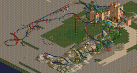
what can you say with the layout of my invert? this is my current project that I've been doing for about 1 month since I dropped Stallion temporarily..I'm very anxious and uncomfortable if I'm doing anything right hahaha (btw, don't mind the launched ride, I'll get rid of them soon LOL )
 -

 AK Koaster
Offline
Thanks for the input. The reason the space ship isn't "structurally sound" is that it MOVES!!! (and should move together if I can get the timing right, hopefully) So imagine this spaceship magically appearing and flying into position. If it works, I could have fun with this.
EDIT: got a chance to look at your post Scarywaffles, that invert is really nice, I like the Black Mamba type look -

 posix
Offline
scarywaffles, please remove that image from your signature. It's way too big.
The screen looks promising from what I can tell. -

 scarywaffles
Offline
never thought I'm disturbing you, sorry for that though, I'll remove it as soon as I can, I'm very sorry.........scarywaffles, please remove that image from your signature. It's way too big.
The screen looks promising from what I can tell. -

 csw
Offline
If its in space tho CSW, It doesn't need to be.... you know because there is no gravity in space...
But there are vicious X-wings in space that will tear a spaceship like that apart. -

 Steve
Offline
scarywaffles, that is looking great. Hopefully the pacing is good since the layout looks massive (but good!).
 -

 Louis!
Offline
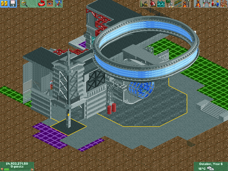
Tired of hanging onto this. I'll try the concept again at another time, this was for a prelim round (best tracked ride, I believe).
Apologies for the lack of frozen staff.9 years later...
No, this is not a joke. This is something Alec and I were supposed to do for H2H3 (before the re-draft--I don't remember the details of why that happened anyway). Obviously not much in the screen, but this is really the first thing I've built on this map that I've been happy with. Alec built the structure to the right 9 years ago and I plan on filling in the rest in due time. />/> to me!
Best 3 Screens since I've been away. -

 Luketh
Offline
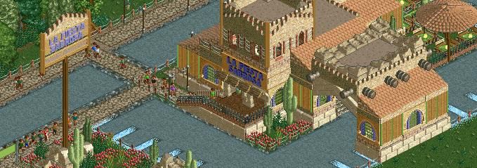
I like the textures, colors, and shapes in that entrance area. I also like how this seems to be on a bigger scale than your last project.
 Tags
Tags
- No Tags
