(Archive) Advertising District / Dump-Place
-
 19-April 07
-

 Luketh
Offline
This might just be me, but I find layouts like yours to be too big for the scale of the game. The turnarounds and initial drop just look strange and kinky to me. While I think this layout would be good if we could smooth out the track more, I think the best way to make it more impressive within RCT's restrictions would be to scale it down so that you can make the elements smooth.
Hope that made sense.
-
 Mattk48
Offline
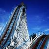
I suppose its not a bad re-creation for rct. The last turn could be better, and the airtime hill going by the station is way out of wack. It'll look better once its supported. How is the pacing? Millenium Force is fast, but with that colossal first drop it might be too fast in rct.
 -

 Dr_Dude
Offline
The turnarounds and initial drop just look strange and kinky to me.
look strange and kinky
kinky

-

 nin
Offline
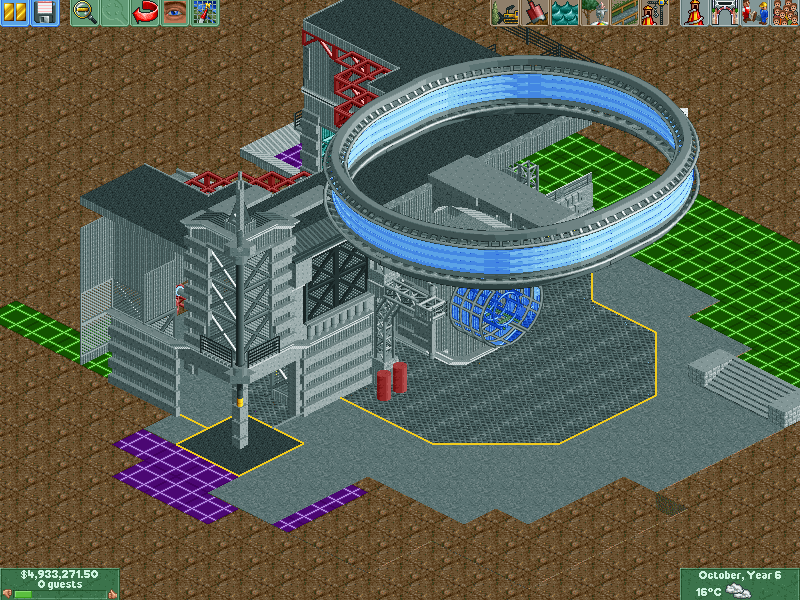
Tired of hanging onto this. I'll try the concept again at another time, this was for a prelim round (best tracked ride, I believe).
Apologies for the lack of frozen staff. -

 gir
Offline
9 years later...
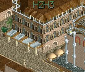
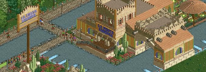
No, this is not a joke. This is something Alec and I were supposed to do for H2H3 (before the re-draft--I don't remember the details of why that happened anyway). Obviously not much in the screen, but this is really the first thing I've built on this map that I've been happy with. Alec built the structure to the right 9 years ago and I plan on filling in the rest in due time. -

 Cocoa
Offline
i reckon that is some great ncso, your work is so atmospheric and lovely. not just on a technical level, but it really feels complete.
 Tags
Tags
- No Tags



![][ntamin22%s's Photo](https://www.nedesigns.com/uploads/profile/photo-thumb-221.png?_r=1520300638)

