(Archive) Advertising District / Dump-Place
-
 19-April 07
-

 Louis!
Offline
I did save as png, it's just paint that screws up...
I apologise then.
Nice screen though, is this a Mack? -

 FK+Coastermind
Offline
I use paint to crop my pictures, and they turn out fine.
Also, who in the fuck legit complains about the blues being a little off in a small dumplace screen? We can't just comment on It?
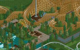
BG, looks fun. Not usually a fan of coasters fully over water, but I like the smoothness of the element.
FK -

 leonidas
Offline
^ Because bad colors can be a pain to watch, and colors are majorly important for the atmosphere.
Besides, it's not that much effort to just download picasa or something. -

 csw
Offline
Bacon Elemental: I would try to think through the architecture a bit more. Bricks are usually only used at the base of a building because they give more support; they are either only the base or the whole building. This may lead to a boring wall of the same texture, but don't be afraid to use fences or smaller walls to break up monotony in walls.
 -

 Fisch
Offline
Bacon Elemental has got to be one of the best usernames in a long time!!!

RCTER2: That's really really cool. Very nice architecture, I really like that. Seems very modern.
Bacon Elemental: Welcome to the site! Id suggest to start with the basic theme park concept if having like 4 different areas and giving them individual themes. In the scenario from the screens you'll basically be limited to medieval themeing which can quickly make it very one-dimensional. So try to experiment and also definitely try to experiment with custom objects! Hope you'll enjoy your time on this website!
BG: That's wonderful! Honestly amazing colors and amazing placement of the coaster! -

 Bacon Elemental
Offline
Bacon Elemental: I would try to think through the architecture a bit more. Bricks are usually only used at the base of a building because they give more support; they are either only the base or the whole building. This may lead to a boring wall of the same texture, but don't be afraid to use fences or smaller walls to break up monotony in walls.
I thought that the bricks you spoke of were more like stones and not bricks, hence my decision to use them as such. I'll try experimenting a bit more with the walls. I do wonder what fences would best be used to break the monotony, though. Thanks
Bacon Elemental has got to be one of the best usernames in a long time!!!


Aww shucks.
Bacon Elemental: Welcome to the site! Id suggest to start with the basic theme park concept if having like 4 different areas and giving them individual themes. In the scenario from the screens you'll basically be limited to medieval themeing which can quickly make it very one-dimensional. So try to experiment and also definitely try to experiment with custom objects! Hope you'll enjoy your time on this website!
Thanks! I've thought of three themed areas that, although are closely related to a medieval theme, are different enough to make the park less one-dimensional... I hope. -

 Cocoa
Offline
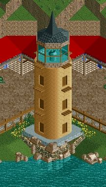
well... it doesn't really look light the lighthouse from either bioshock games. but maybe I'm misinterpreting the quote
-

 Maverix
Offline
Indeed you arewell... it doesn't really look light the lighthouse from either bioshock games. but maybe I'm misinterpreting the quote
 />
/> Just took insperation from the story for this park, probably should've mentioned that.
-
 Mattk48
Offline
The green barrels and the odd green bushes make the whole screen look aqward and unnatural. The hunting post is ok
 -

 Bacon Elemental
Offline
So I tried cleaning up my texturing and this is the result:
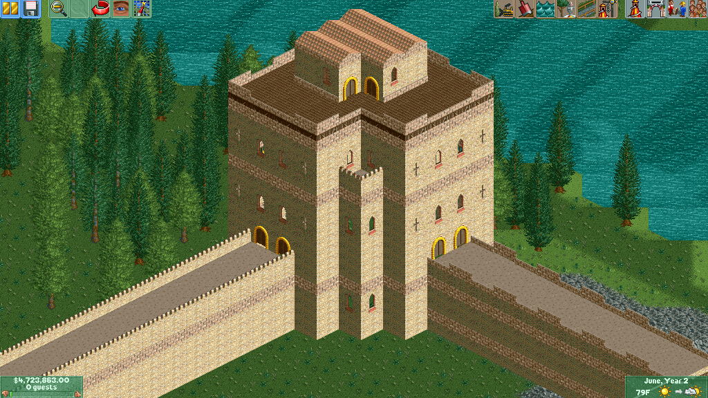
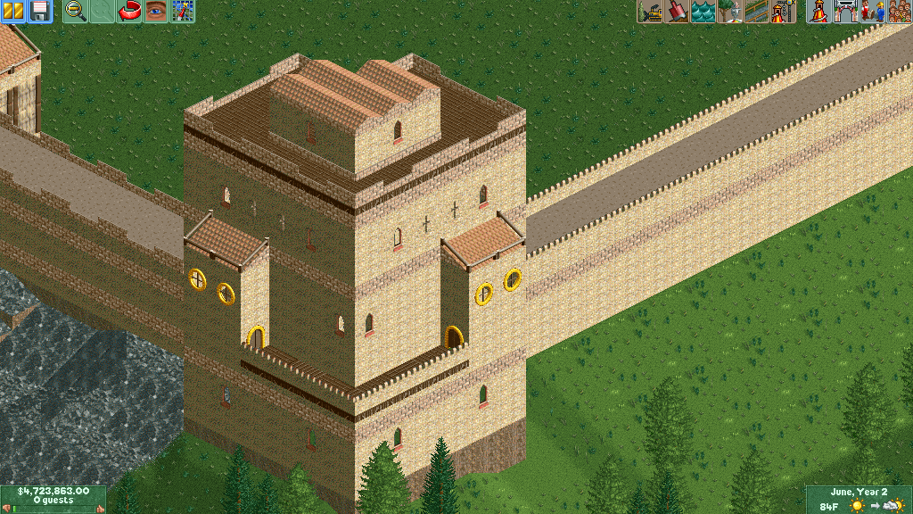
Also, which looks better: the new wall (1 line of stone) or the old wall (2 lines of stone)? -

 Arjan v l
Offline
To me, neither makes much difference...
What i really miss in this screen is variety.
Everything looks very 'blocky'.
The shapes aren't interesting or even realistic.
The shapes of the structures could be so much more versatile.
For instance... you could add arches to the walls or something else to break it up somewhat, same goes for the buildings, they look so monotone now.
I see it's ncso, but then still, there's room for improvement. -

 Liampie
Offline
That actually works, for what it is. If you can make the architecture more interesting and add some colours here and there (some flower patches?) that's certainly an enjoyable screen. It reminds me of old Dutch parks.
 Tags
Tags
- No Tags
