(Archive) Advertising District / Dump-Place
-
 19-April 07
-

 posix
Offline
Liam, #2 is terrible. The rocks are already super complex. Varying their colour is just overdose and wrong. You've tried hard to synthesise them and came pretty close. If anything, I'd try to reduce them a little, mix in regular land-tool raised rock pieces here and there to relax things. The green of the palm objects is wonderful in combination btw.
This a fresh new style from you you take in that project. Just what you needed. I'm excited to see more. -
 Coupon
Offline
if you haven't listened to yeezus yet, dont bother to.
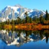
in other news, mt baker design coming soon?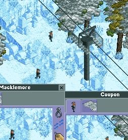
-

 6crazy6king6
Offline
Is this Support good?


* I know, there is a missing piece of support. But I wanted to hear the opinions first, before i used hacks. -

 Bacon Elemental
Offline
First and foremost, I'd like to say hello to everybody at New Element.
I've been playing RCT2 for over 6-7 years now (though my real playing time's more on... 2-3 years I guess). I've had this little project in my head for quite a while now, and that's to turn the RCT2 scenarios into completed parks that don't totally look like butt. I have few of my old creations lying around, and I thought they looked okay. But after seeing the parks here at NE... I felt like my parks weren't good enough, so I'm giving it another go, starting with Crazy Castle.
It's really bare right now because I'm starting with the castle itself before moving on to the actual park.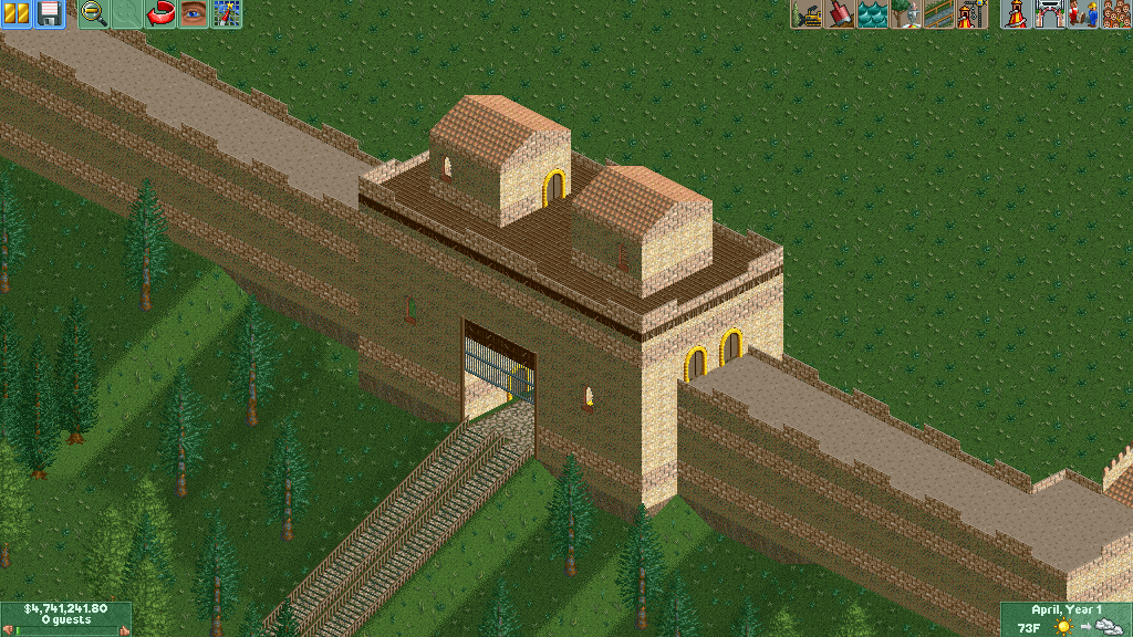
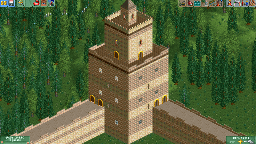
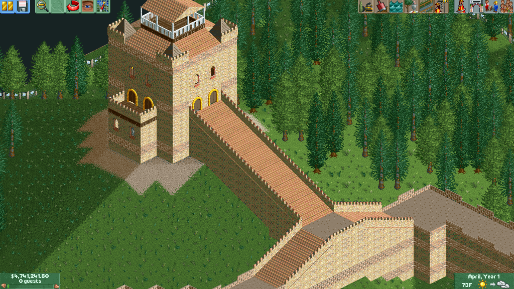
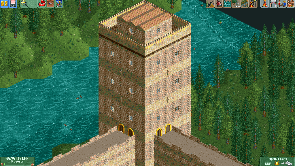
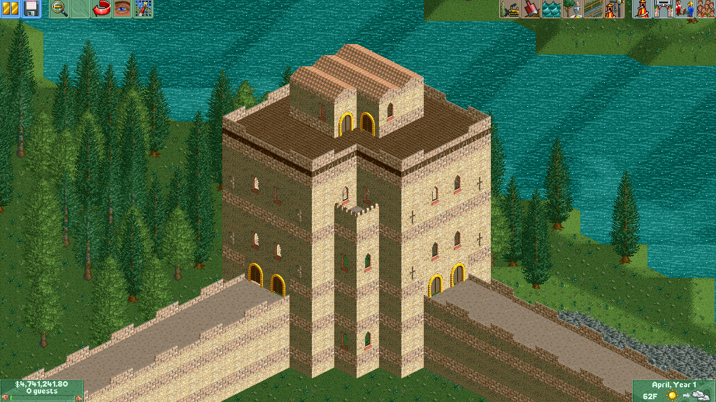
This is incomplete because I'm still not 100% sure on what to do with it.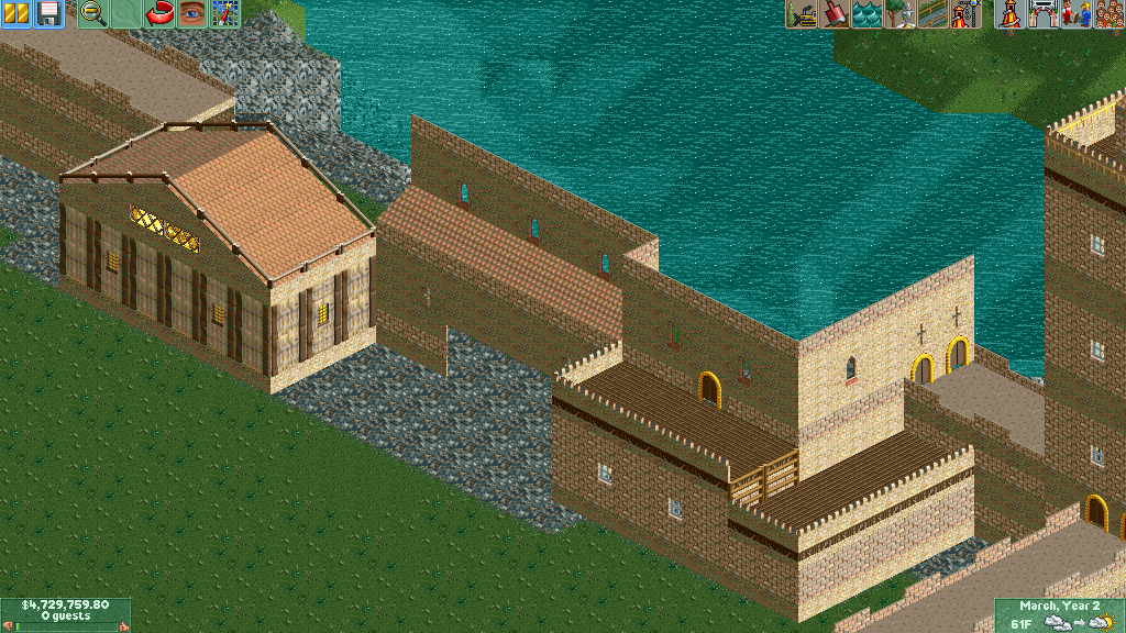
Also, here are my old creations in case you'd like to see them (Crazy Castle, Electric Fields, Fungus Woods): Fungus Woods.SV6 (1.01MB)
downloads: 185 Crazy Castle.SV6 (856.19KB)
downloads: 153 Electric Fields.SV6 (809.57KB)
downloads: 135 -

 Fizzix
Offline
Welcome to NE! The scenario idea's really been popular here the last few weeks, but feel free to branch out into completely custom parks in the future. These show promise, but feel very plain to me. Not necessarilly a bad thing. My opinion may change when foliage is added.
 -

 Austin55
Offline
don't edit your pictures in paint cause it jacks up colors. Otherwise, really nice. Not much to that screen but what's there is executed to BG quality. So good.
 Tags
Tags
- No Tags
