(Archive) Advertising District / Dump-Place
-
 19-April 07
-
tdub96 Offline
Thanks for all those responses guys. Much appreciated.
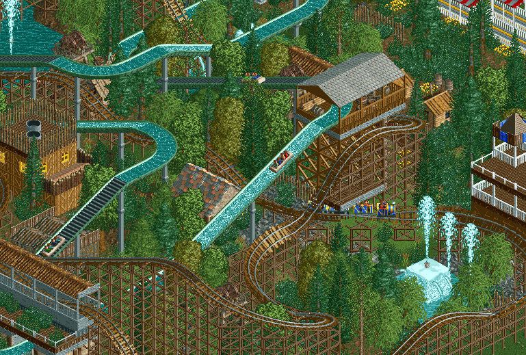
SC, loving that water tower. Looks much better than mine, mind if I borrow the concept? Other than that, the coaster looks pretty sweet. Not sure if I'm a fan of that pre-drop element, but the cliff-hanging interaction is good.
-

 Hex
Offline
Thanks for all those responses guys. Much appreciated.
SC, loving that water tower. Looks much better than mine, mind if I borrow the concept? /> Other than that, the coaster looks pretty sweet. Not sure if I'm a fan of that pre-drop element, but the cliff-hanging interaction is good.
Sure! You can use it. I think I stole it from Insanity's NCSO park. I basically just tried to remember that screen and used the barrels as poles. Glad you liked it, and thanks for the feedback! -

BigB Offline
Try to higher a corner of land at your 1 tile high waterfall to make it break the water, imo it looks a bit unnatural if you have this waterlevel differences without any natural borders... -

 Hex
Offline
I really enjoyed the Log Flume - Coaster action that tdub had, so I thought I'd give it a shot.
-

 Louis!
Offline
For me, out of these, #1 is clearly better.
Although, I would suggest making #3 using 1 as a base, and mixing in a few spots of grey, as it's the black that ruins 2, not the grey. -

 BelgianGuy
Offline
I agree ditch the black in 2 and use more thin foliage in between the rocks, will also make it look more lively...
 -

 Faas
Offline
I actually kind of prefer number two. I like the different rock type, especially since it looks geologically interesting.
 -

 csw
Offline
Looks nice tdub! And Liam, I agree with Louis, add some speckled grey in there. Even though there are black rocks IRL they don't really look good with that object.
csw
Offline
Looks nice tdub! And Liam, I agree with Louis, add some speckled grey in there. Even though there are black rocks IRL they don't really look good with that object.geologically interesting.

-
 inthemanual
Offline
Ruishi pulled off black rocks really well. I think they work, but not with the brown ones. The black needs to dominate or not be there.
 -
![][ntamin22%s's Photo](https://www.nedesigns.com/uploads/profile/photo-thumb-221.png?_r=1520300638)
 ][ntamin22
Offline
although if they are all the same project you might as well start a topic.
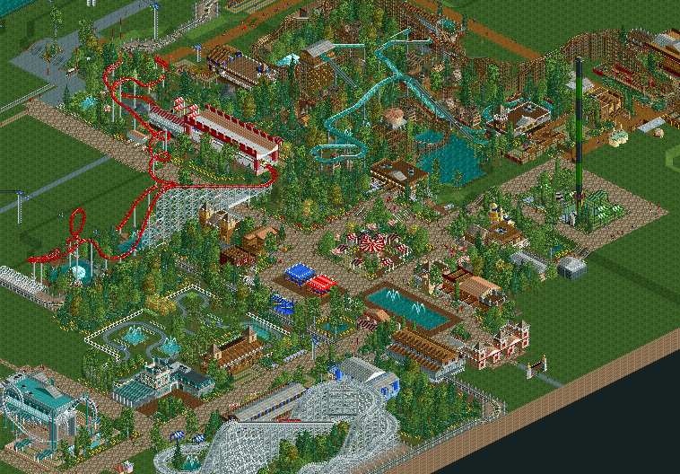
I really, really like that. Lots of cool interaction with path, neat station, the whole composition of the area is very nice with the loop as the centerpiece. -

 Faas
Offline
Cool screen, although I think that the rollercoaster has too much straight pieces of track. It almost looks like a transportation ride with a loop.
 Tags
Tags
- No Tags


