(Archive) Advertising District / Dump-Place
-
 19-April 07
-

 Jan.K
Offline
Is that a waterslide or is the 3D cinema just happy to see me?
Hahahah!
I love that bridge made from track! -

 AvanineCommuter
Offline
Just an opinion, but for me this trend of NCSO kind of doesn't really hit home all the way for a lot of the parks I see posted. I think that with such a limited palette to choose from, there would be more innovation and integration of trackitecture, pathing as architecture, landscaping, foliage, etc. to make up for it, but there isn't. Most of what I see is dull and uninspired, but people go "nice!" all the same. Is this just me?
Edit: this is not directed at you tdub, just in case that was unclear! -

RMM Offline
Didn't want this to get lost in the NCSO.
shut your face. go work on that LL disney park. -

 Liampie
Offline
Just an opinion, but for me this trend of NCSO kind of doesn't really hit home all the way for a lot of the parks I see posted. I think that with such a limited palette to choose from, there would be more innovation and integration of trackitecture, pathing as architecture, landscaping, foliage, etc. to make up for it, but there isn't. Most of what I see is dull and uninspired, but people go "nice!" all the same. Is this just me?
I don't the 'nice' comments are unjustified, because most NCSO screens are actually nice, but I agree that they're often dull and uninspired as well... But fuck, most work on this site is nowadays. -

 Arjan v l
Offline
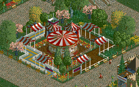
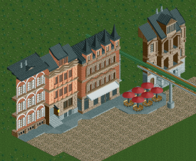
@ Corkscrewy : Nice screen. I like that Dippin Dots stand, as well as the architecture in the upper right corner.
@ Jonny : Looks nice Jonny. That cinema with that 'happy to see me' object, reminds me of the movie Thor, is it supposed to resemble that transporter device from the movie?
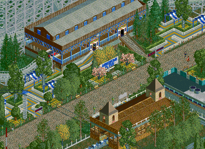
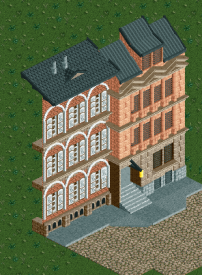
@ tdub : The path is very straight, so path planning could be better i guess.
@ Prodigy : I like the fact that you're trying to break away from the rectangular shapes in rct, but this looks really messy.
@ Gijssie : Looks nice so far, but i'd like to see a more filled screen though. -

 Fizzix
Offline
Looks good everybody. Tdubs, didn't know you played NCSO. The station of American Flyer looks a tad bland to me, I don't know if you can add some architectural variation. The greenery is nice, seeing a lot of trees I normally don't in there! Love the screen Jonny.
 -

 FK+Coastermind
Offline
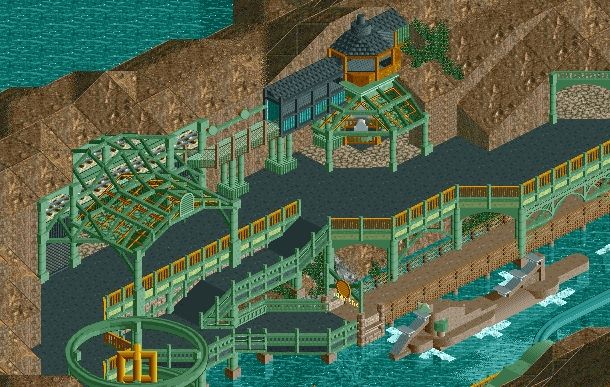
Love the atmosphere and look, particularly the lattice work. That submarine could use some work though, too blocky and alittle too small. Seeing as its a sculpture, I'd love to give ya help if ya want.
FK -
![][ntamin22%s's Photo](https://www.nedesigns.com/uploads/profile/photo-thumb-221.png?_r=1520300638)
 ][ntamin22
Offline
Very cool indeed. I'd like to see a little more color variation in the ironwork even if it is a departure from real life.
 Tags
Tags
- No Tags
