(Archive) Advertising District / Dump-Place
-
 19-April 07
-

 JJ
Offline
Its not that little of a detail. Its a sign, signs are meant to be read.
Yes but the colours make it very hard to read. -

 Nokia
Offline
fighting is just what i do.
its like the black side in me.
[says that with no racist fealings toward black people.] -

 JDP
Offline
Everyone shut the fuck up and post your bull shit some where else.
Ryan wins. Period.
-JDP -

 Nokia
Offline
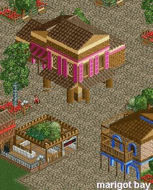
a screen from a park that i will need help on in the future.
feedback please.Edited by Nokia, 23 June 2008 - 01:18 PM.
-

 Camcorder22
Offline
You might want to put some gardens or something around the one in the middle so the path isnt surrounding it so much. That building could also use some layering of some kind on some of those walls.
 -

 DelLagos
Offline

Little (old) screen from my project...
Sorry for those graphic-things.
Hope you like it!Edited by DelLagos, 24 June 2008 - 07:22 AM.
-

 Nokia
Offline
re support the barrel roll
looks nice other than that.
maybe a little too heavy on the grass. -

 DelLagos
Offline
@Nokia: Well, the supports are rebuild now...
@Regulatin: What do you want to say with that? -

 Fisch
Offline
@Nokia: <3 ablsolutely lovely!
@DelLagos: I don't think that you can call a coaster that only has a station building "themed coaster" and a themed coaster is what we all on this forums are tying to attempt.
Regulatin wants to say that you're definately too addicted to the grass object and you should lower the amount of grass in this screen and in my opinion also in every other screen ur showing.
Ur using this object by far too often!
Warum nimmst du nach der Heartline Roll nicht so ein umgekehrtes "V" als Stütze?Edited by Fisch, 24 June 2008 - 09:46 AM.
-

 Magnus
Offline
Nice work on the supports dellagos. Looks a lot like what gerstlauer would do for their eurofighters.
However, I do not think you pulled of the theme too well. It is really hard to make something looking really good only with a few buildings, grass and trees. You need a lot of experience with the game and isometry for that which is why only so few people can do it.
It looks like you do not belong there, yet (maybe?). You are developing into the right direction though. Good luck with that. -

 DelLagos
Offline
@Fisch: Yeah, thats right. Okay, I will delete the grass and try to use less of it. And I will rebuild the support after the roll.
Also this is not the complete coaster, its not finished yet. There will be a few more buildings, but thats it. It should look like forest/Alpine...
@Magnus: Thanks. Yeah, it´s hard to find the perfect way to build this theme. But I will look what I can do. I hope the next screens are a bit better!
 Tags
Tags
- No Tags


