(Archive) Advertising District / Dump-Place
-
 19-April 07
-

 Pacificoaster
Offline
imageshack is under the domain of .us which may be the issue. Therefore, those outside of the states cannot see these screens. Tinypic seems to work well for me.
 -
 Corkscrewy
Offline
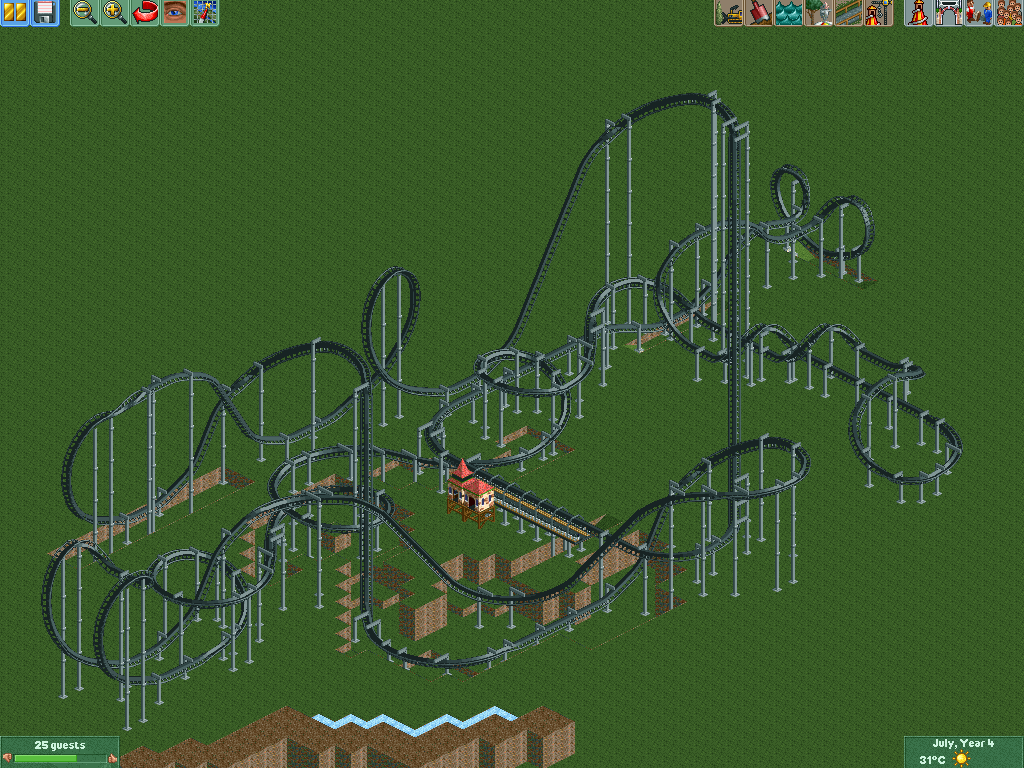
It looks like 2 roller coasters rolled into one. Haha just too much unnecessary track. Like the 3 helixes after the cobra roll. Could just be my opinion tho.
 -

 Pacificoaster
Offline
I agree with Corkscrewy. There is too much transition between the dive loop and cobra roll and also between the cobra roll and corkscrews.
 -

 Sephiroth
Offline
If you're going for a realistic blocking scheme: I agree with pac and corkscrewsy. If you don't really care about blocking: holy crap that is a very pretty coaster from this angle! Love it. It's a very good fantasy coaster as far as I'm concerned.
 -

 Xeccah
Offline
the coaster has no flow whatsoever, two sets of double inversions which is wrong, and seemingly would at the end be ridiculously slow
 -
 inthemanual
Offline
I like a lot of the elements that are in this, but I don't like them all together. It feels... overdone. I think if you split some of the cooler elements from this into 2 or 3 different coasters, I'd probably like all of them, but it just isnt working for me as a whole.
 -

 FK+Coastermind
Offline
I like it up until after the cobra. Before it looks like a blast of speed and inversions. The corkscrews and paths to and from are too long and out of the way. Some first start landscaping might help u determine a better way to end the coaster.
FK -

 SSSammy
Offline
the fuck? are we all looking at the same screen? i think it looks great, and if you don't care about realism, it will do just fine. if you do care about realism, however... well, see above.
 -

 Liampie
Offline
Though it could do with a helix or two less I like that layout too. Especially the lenght.
 -

 gir
Offline
I think it looks okay up until right after the cobra roll, though the dive loop's entrance is probably too exaggerated. After the cobra roll though, it's a mess of helices and inversions. Maybe remove some helices and get rid of the batwing? Maybe add an MCBR? I dunno.
 -
 Mattk48
Offline
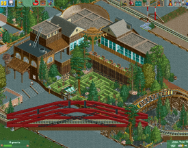
Nice, I think whats making it seem too tarmac is:
1. the back patio needs to be another texture
2. path at the top of the screen is way way way too wide
 Tags
Tags
- No Tags


