(Archive) Advertising District / Dump-Place
-
 19-April 07
-

 leonidas
Offline
That's because RCT3 has risen above being just a game. We like to give expression to things beyond to the game, like showing the structural beauty of brutalist architecture. RCT3 is just a tool to achieve real content, expression, beauty or atmosphere. It's the message that's primary to all else. We strive to tell stories, move people, unveil beauty etc. And we like to tell those things as if any stranger that is unfamiliar with the way it was built, would get the message just the same.I just don't get RCT3. Screens are adjusted post game to make them look good :/
It's not about how many pieces you used, or how many hacks you used. It's the about a result that is strong in appearance and content. It's completely irrelevant whether Van Gogh used a tooth brush to paint his pieces or not, relevant is how successfully he (ab)used paint to portray a massage.
EDIT:
RCT2 has a beauty of it's own, a charm that is playful and more spontaneous and lively. The end result isn't in still pictures, but in a living world on itself that you can dwell in. Both are amazing in a completely different way. -

 AvanineCommuter
Offline
I personally dislike that kind of architecture, but I do have an understanding for it. Misunderstanding is a phenomenon that's always present in architecture. The question is whether it affects the appreciation of it in a positive way or not. Brutalism however rarely gets that and I can get that, because it's hardly inviting as it's not very human. A small group will like it as it's something grand for the people who understand it as opposed to appeal to the masses. This is fine for art, but I find it a folly in architecture as architecture in the end is bound to the limits of reality, something art doesn't have to answer to. (I don't really like Corbusier's stuff, but I do understand the aims and his contributions which i can appreciate. Rule one in architectural studies is to see through the visible.)
Agreed and agreed.
-

 inthemanual
Offline
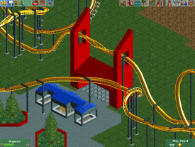
I really like all the interaction between the coaster and everything else that's going on in this screen. The colors however, look really weird as they are (with unfinished surroundings and all), and they'll probably look better when the area is finished, but I still feel like they'll be too bright/contrasty/something.
 -

 Louis!
Offline
But I still don't get the point. Why would I want to build something just for a screen, I want people to look at my work in game and if I've adjusted all my screenshot post game it's just not gonna look as impressive in game.
 -

 leonidas
Offline
I think it's like architects who render something in 3D, and then edit pictures to show their concept as if it was real. You do it, because it kinda feels like you brought your concept to life.
And it's not like RCT3 players edit every shot, they often show 'WIP' pictures of the in-game design as well, and then provide "concept-arts" to show how it would look if their design would actually exist. I think it's because parks in RCT2 are already very vivid and 'alive' when you open them in-game, while RCT3 projects are kinda just cold designs, and come to live in the (often story-line) picture updates.
Design < > Presentation - That's a discussion that's being held over and over in the RCT3 community.
5dave - I seriously think that's most ugly architectural monster I've ever seen. xD
Liam - I like it, because I think it's beautiful. I couldn't care less how 'elite' that would make me. The style wasn't successful for living spaces, but really successful for state monuments, city halls and libraries: http://upload.wikime...y_Hall_2011.JPG
Many examples of either greatness or failure in this thread: http://www.skyscrape...t=994659&page=4 -

 Louis!
Offline
See like sometimes I get the feeling of wanting to play RCT3 but then I realise that no one would see it in game so what's the point lol
 -

 AvanineCommuter
Offline
@ Louis!
They would still be able to see what you've built, regardless if it's in game or not.
@Leonidas
I really dislike brutalism, it's just so ugly, cold and uninviting... and don't even get me started about when it rains! *vomits*
I don't understand the appeal. -

 leonidas
Offline
What do you mean?See like sometimes I get the feeling of wanting to play RCT3 but then I realise that no one would see it in game so what's the point lol
If you check my dump(lol) you'll see that I recently shared one of my structures with scenery zipped allong. Just like with RCT2, only not automatic. (a few people here have downloaded it, I'm quite curious whether it worked out).
There's a new tool that automaticly finds all custom scenery you used for a project and zips it allong with the project itself. The only downside is the long upload - and download time. -

 FK+Coastermind
Offline
i get it's a recreation (or at least i hope it is), but other than representing the original, it does nothing for me. Too boring and simple and at times awkward as a result of attempting to be realistic.
FK -

 Louis!
Offline
I built it in like 15minutes, it's not meant to do anything other than represent the original as best as possible, whilst keeping in game flow. And I personally think it has got flow and isn't awkward.
#DATFlOW -

 robbie92
Offline
It's a solid recreation, imo. Looks a bit dinky, though, like it should be 150% the size it is at the moment. It could help it look better in instances like the inclined turnaround made with the small turns.
 Tags
Tags
- No Tags


