(Archive) Advertising District / Dump-Place
-
 19-April 07
-

inVersed Offline
Hey, its been months since i last poster here (or played RCT2) anyways whats new?
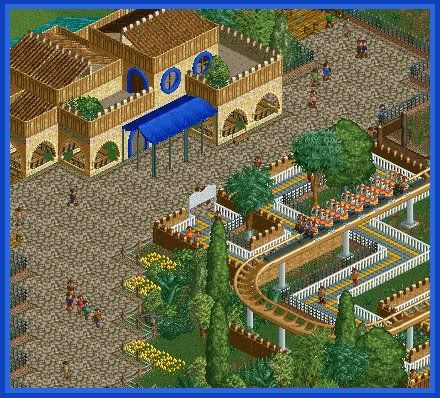
Heres something i started messing around with recently... i may formally advertise this soon, if this game continues to keep my interest for that long.
Edited by inVersed, 16 June 2008 - 07:55 PM.
-

 nin
Offline
more no cso..?
but you have an excuse. and know how to use it. .
.
Edited by nin, 16 June 2008 - 07:59 PM.
-

 geewhzz
Offline
Nice to see you back, I've always been a fan of your work, inVersed. Everything looks lovely here, except the jungle bushes.
 -

 Comet
Offline
This is great, and if your enjoying it keep going with it.
But I liked your older stuff like the woodie design much more.
This is good though, didn't even realize it was no custom scenery at first. -

 FK+Coastermind
Offline
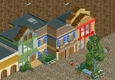
Nokia, that looks great! the buildings look very good, not blocky, not over texturized, but refined and clean, yet detailed. the ice cream parlor is my favorite. the doorhandles is a great touch. i would say, add the same windows you used on the bare wall of the second building. right now it looks like you just missed that wall. im not a fan of the last building cause it looks kinda boring, and i have a semi-grudge against those doors, because they look so cartoon-like. the foliage is nice, although i think those two bushes and the barrel look out of place. like what i see, just dont forget to give your buildings purpose!
FK -

disneylhand Offline
Each of those doorhandles are the size of that handyman's head.
Realistic details like that are nice until they seem forced like that. You'd be better off without them, in my opinion.
-disneylhand -

 Nokia
Offline
could be something, or could be nothing. all in good time.
Edited by Nokia, 20 June 2008 - 07:05 PM.
-

 nin
Offline
It's nice. A little too brown for my likings, but it's nice. My advice would be to change the coaster's colors. Make it stand out more.
 -

 nin
Offline
my bad for double posting. oh well.
removed
Just something that had been working on not to long ago (before my SF park). It helped me find my style, etc.
Will I ever finish? I hope so. -

 Xophe
Offline
Nokia - I like it, but as nin said, make the track a brighter colour. I don't think I've seen a beige roller coaster in real life. They're usually way more eye-catching. I would also get rid of the grass inside the building haha!
nin - looks like a good start. I hope to see more of it! -

 jusmith
Offline
nin- is that what you had been showing pictures of at rctspace? I love what's there.
 -

 Nokia
Offline
is it for your sixflags park?
for some reason it reminds me of a train station.Edited by Nokia, 21 June 2008 - 03:02 PM.
 Tags
Tags
- No Tags


