(Archive) Advertising District / Dump-Place
-
 19-April 07
-
 ELVISthePELVIS
Offline
Nice, Super G!
the only thing I can see that's a wee bit bothersome is the sense of scale seems to change from one face to the other. it seems as though on the left, it's two stories, while on the right, it's just one.
It's probably just the way the picture was, i don't know. either way, you're lightyears ahead of anything i've done. much respect to you, sir! -

 Super G
Offline
The textureless roof flattens the entire thing out.
Will see what I can do, but the roof as it is now is exactly the same as in the real building. But maybe I can take another block for it, or just do something different and don't make it a rec..Nice, Super G!
the only thing I can see that's a wee bit bothersome is the sense of scale seems to change from one face to the other. it seems as though on the left, it's two stories, while on the right, it's just one.
It's probably just the way the picture was, i don't know. either way, you're lightyears ahead of anything i've done. much respect to you, sir!
In the real building, the front side of the building is no more then a flat wall, and it sticks out from the roof, but due to scale problems that is something I can't get it right. Thank you for the compliment.
Yeah, maybe I change the colour to white or brown, but it is pink in the real building. Or at least it was before the restyle...Quite alright, but the diagonal tower doesn't suit in that structure i.m.o.
-
 AK Koaster
Offline
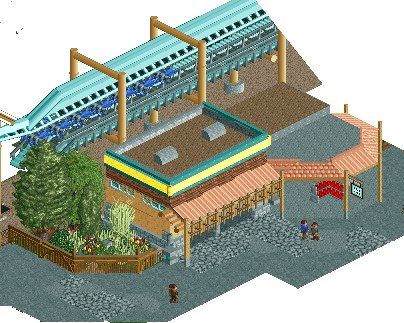
Well, after a brief recess from the game due to some computer problems, I was finally able to open one of my projects that I had wanted to post during Fiesta. It's a small project, but I'm using it to improve my parkmaking & architecture
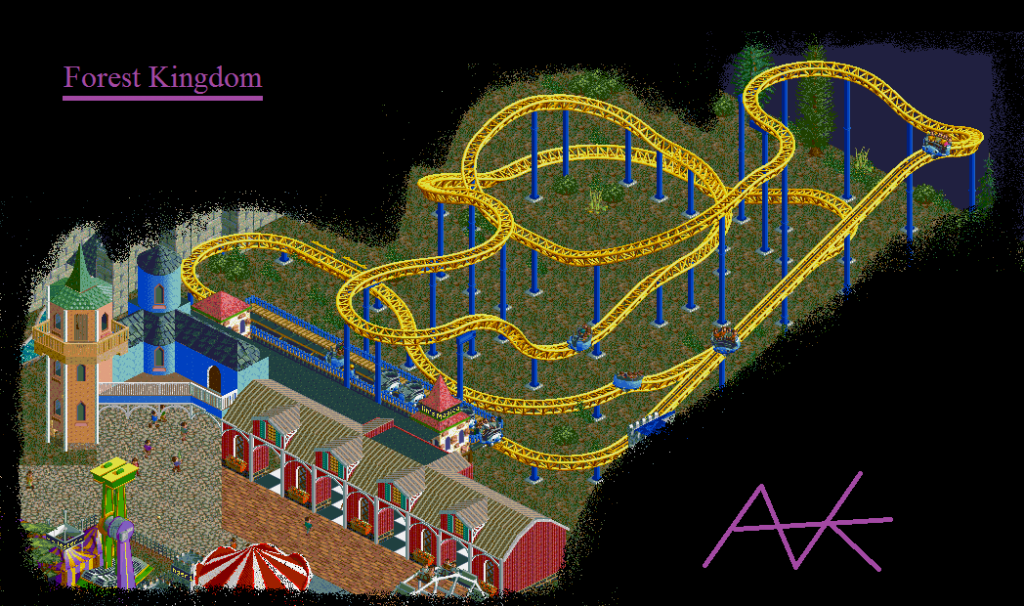
EDIT: please note that it is unfinished. I'll be working on getting actual supports and hidden entrance/exit huts, as well as a real station -
 Mattk48
Offline
I like the corner support piece, but something's off with the steep vertical support before it. Maybe its too wide?
AK Koaster
I really like that castle structure in the left corner, but the red barn building doesn't fit. Also, the transition between the brick and crazy paving paths is brutal. It hurts my eyes. -

 ELVISthePELVIS
Offline
Well, after a brief recess from the game due to some computer problems, I was finally able to open one of my projects that I had wanted to post during Fiesta. It's a small project, but I'm using it to improve my parkmaking & architecture

EDIT: please note that it is unfinished. I'll be working on getting actual supports and hidden entrance/exit huts, as well as a real station
I think you should try and use the mini-coaster track for most of the whirlygig coaster. As it is now, it seems like the scale is off between the track and the carts. also, the path transition being in line with the barn's edge is a little jarring. maybe move it over a wee bit?
all that said, I really like the architecture. it's very reminiscent of a ren-fair or something similar. I think the layout for the coaster is quite good as well. I am looking forward to seeing some context as you're able to complete more! -

 AK Koaster
Offline
Thanks for the input. I was basing this off of Galaxy Orbiter at the Edmonton Mall in Canada, which did have a track structure resembling a giga coaster track, but it seems that was the only Gerstlauer spinning coaster that featured that design, most likely because it was indoors and finding room for footers was probably difficult. Because of this, I'll probably change it to mini coaster, mostly because that won't take long at all and it will look better. The barn and the bad transition are gone, and the coaster now has an actual station with the building that replaced the barn acting as a que building and restaurant.
 -

 Angroc
Offline
If realism is a concern, I'd understand, but i find the look of the spinning carts on the giga coaster tracks. Add some nice custom supports and I think that could look real neat. Or maybe change from gigacoaster tracks to mini-coaster tracks somewhere.
 -

 Louis!
Offline
^Oh, one more thing. Change the grey roof colour to something else as it's the same as the pathing underneath.
 -

 Liampie
Offline
50% of the screen is concrete, 25% is a completely uninteresting brake section and the remaining 25% is a glitchfest. You can do better.
 -

 robbie92
Offline
^You're sounding like dark_horse. It's not nearly as bad as you're making it out to be.
Austin, I love it. I can't wait to see what you can do with my ride. -

 dr dirt
Offline
@Sephiroth only thing I don't find appealing is the fact that its a bunch of stacked cubes. I think if you'd alter it by heightening the horizontal bars by a notch or two it'd be easier on the eyes. like it a lot though.
 Tags
Tags
- No Tags


