(Archive) Advertising District / Dump-Place
-
 19-April 07
-

 Pacificoaster
Offline
Textureless. Perhaps try using a different path type and break it up with bits of foliage.
 -

 FK+Coastermind
Offline
For me, its too much organic swoopy smooth for the sudden wild mouse spin section. I liked the wild mouse u did for coups park, but this seems disjointed to me.
FK -

 robbie92
Offline
Up until after the helix drop-off from the switchbacks, this is pretty much flawless. Great flow for a Maurer-Sohne. Hopefully the pacing is good.
 -

 Liampie
Offline
Except for a few fairground coasters, Maurer spinning coasters never have such wild mouse sections. It's completely realistic, but it's not completely credible. Large swooping turns are way more fun and Maurer knows it. Besides, it doesn't look very good there. Also the mix of two track types looks awful; I can see why you sometimes need to merge two track types because of certain elements not being available, but I don't get why you (and some other people) would rather have 35% of the track type accurate with sloppy transitions and messy looks, than a single smooth piece of track. The more consistent, the better. In this case all you need the mouse track for is the wild mouse section.
Sorry, not a fan.
edit: btw, your coaster might need some more block sections. It's very common for a coaster of this type to have 2-3 mcbr's. -

 Louis!
Offline
OMFG LIAMPIE GIVING REALISTIC COASTER ADVICE
<3 <3 <3
pac listen to him, he finally knows what he's talking about
-

 ELVISthePELVIS
Offline
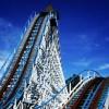
Here is my attempt at a steel superstructure for a wooden coaster. very unfinished.
Let me know what you think!
-

 ELVISthePELVIS
Offline
Pretty cool
 />
/>
thanks! i looked at some of your stuff just now, and I must say, some of your layouts are quite wonderful. the grizzly one was quite good, it seemed. -

 nin
Offline
While I do think the supports are too thin, the footers are my main issue as they're downright huge. Id swap them out for something smaller.
 -

 Steve
Offline
Justin, I don't know fuck all about that kind of coaster, but it looks goddamn beautiful and like a fun ride to boot. Nice work, dude!
 -

 Maverick
Offline
I'd rather custom support a wooden coaster in NoLimits than try to do that in RCT... Dang.
But you should make sure you don't have any sections that stand out as having spans too wide for the beams. You'll want to stick to 1/4 tile objects, because going the full width of the tile seems too much. -

 ScOtLaNdS_FiNeSt
Offline
You looking at the right page?....some of your layouts are quite wonderful.
 Yeah listen to Nin, Use deco blocks or something there.
-

 Angroc
Offline
While I do think the supports are too thin, the footers are my main issue as they're downright huge. Id swap them out for something smaller.
I was thinking it lends some charm to the thing. It's sort of like how in some videogames proportions are exaggerated.
As for critique, I'd say try to see if you can seperate elements somehow? Since RCT is orthogonal, it can easily bring some escheresque headaches. With your structure there's so many even spacings its hard to discern depth in the structure, with the footings the only thing to go by. Maybe by using different beams with different widths, and slightly vary colours, you could bring it out its dimensionality?
I commend you though. I don't have the patience for custom supports, let alone on a woodie!!
 Tags
Tags
- No Tags


