(Archive) Advertising District / Dump-Place
-
 19-April 07
-

 Maverick
Offline
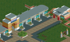
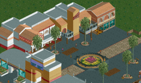
I think it looks fantastic. But I can't figure out the scale. Is the whole picture supposed to be 1/2 scale? (When compared to RCT-scale)
 -
![][ntamin22%s's Photo](https://www.nedesigns.com/uploads/profile/photo-thumb-221.png?_r=1520300638)
 ][ntamin22
Offline
Some more NCSCO, no-trainer work on the Magic Mountain scenario from me, just to show I'm still alive. The station of a rapids ride where 'Superman: Escape from Krypton' is/was normally located. I'm afraid it's unfinished. Comments/criticism welcome as always:
'Do not listen to her song,
Her gentle, haunting cry,
She wants you dashed upon the rocks,
The wicked Lorelei.'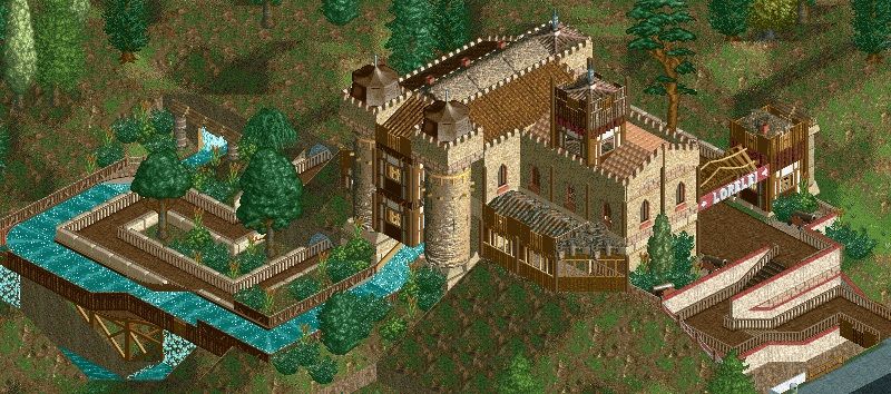
Lovely composition. This is very nice stuff.
if I had to put my finger on why I like it so much, I'd say that it demonstrates how NCSO bridges the gap between LL and modern RCT2 construction. -

 nin
Offline
Yeah I really like the main body of that castle. The big wall with the towers looks great.
 -

 Pacificoaster
Offline
Yeah I really like the main body of that castle. The big wall with the towers looks great.
-

 csw
Offline
I agree with this, the roof is a little conspicuous. I also noticed that there are no doors on the building in the front and centerI really like the structure itself, I feel like it gives something along the lines of what you said you were going for. I don't like the roof however, it seems messier than the rest of it.
 />/> how're the peeps gonna get to work?! But overall, it looks great.
Here's a small piece of my own work. -

 Xeccah
Offline
Though, yes, it is an improvement to your norm, I still find it uninspired. Truth is, NCSO is a far harder way to go than CS, and as I've seen your efforts in that, I think you should focus on that.
 -

 chorkiel
Offline
I personally think you can do way better, MCI. It feels a bit forced, sometimes random and uninspired.
 -

 Liampie
Offline

That's better than your usual stuff, it has more of a themepark feel.
Still room for improvement though. How's this? Just working with what you have in the screen.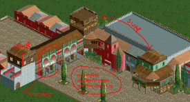
Most important improvement is the removal of the horrible planter in the middle and the distracting and even nonsensical path mix.
In the entrance/exit building, I moved the columns around so that there's exactly one tile between two columns, plus they aligh with the signs. I made the arches align as well, and lastly I added some random decoration to the roof.You now have both horizontal and vertical lines in your building.
I thought the tower on the left was slightly too high so I lowered it. Still not ideal but I was working in paint, plus it's your screen and it'd be rude to completely change it.
Lastly, I swapped the tops of those other two towers. The green building was alright and I really like the balconies, but to have those balconies I felt that the building had one floor too many, or the balconie should've covered two floors. Moreover I think the roof in my version makes the building more cohesive, in terms of shape, colour and texture. -
 inthemanual
Offline
I like it more than Condor
This was my first thought. This looks really good, but I still think Condor is strong. I hope you turn this into a full park or at least do SOMETHING with it. -

 Fizzix
Offline
I like that a ton, Shotguns. I'd love to see that expanded upon. Love that color scheme.
 Tags
Tags
- No Tags

