(Archive) Advertising District / Dump-Place
-
 19-April 07
-

 Liampie
Offline
shouldn't more of africa be yellow
Actually yes, but it has too look a bit cartoonish!
Thanks everyone btw.
-

 lucas92
Offline
Well, it would also look cartoonish if you add a little bit of yellow anyway...
Very good idea. I like it!Edited by lucas92, 07 June 2008 - 03:43 PM.
-

 CedarPoint6
Offline
Both have far too much path and not enough to break up the large spaces. I'm generally not a fan of the lighter colored path, although I guess it depends if you want asphalt or concrete paths. I'd probably take the contrast of asphalt.
 -

 Ge-Ride
Offline
What a coincidence, Liampie! I'm currently working on an RCT recreation of my home planet Geon! My world, as you can plainly see from this incomplete pic, is quite different from Earth. It's in the 18.247th dimension somewhere around Zwilblax. Before I changed to human form, my microscopic interdimensional teleportation device was located around my ibslatch (the reproductive organs of my species which are sterile until the one ideal moment for reproduction), and after turning into human form I've searched for it in the corresponding areas. Since then, however, I've grown quite fond of certain earth customs which have proved delightful enough to keep me here. This is a screen of the progress on the recreation of my planet which I've built from my amazing memory, but with the different proportions inherent in our given dimensions, some aspects might be a bit strange.
-

 Ripsaw
Offline
This is the first time ive ever hacked a custom flat ride
This is my attempt at a Mondial-Ultra Max,The worlds first was Amazing Confusion at Fantasy Island in Skegness England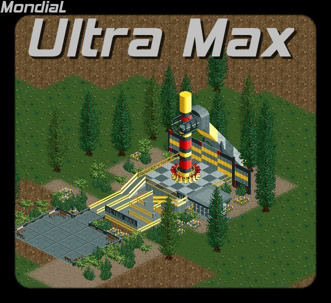
If all goes well i might to a Ultra Max for Thorpe Point! -

 lucas92
Offline
G-Ride: I really like your stuff. It's so different. Keep building that way!
Ripsaw: that custom ride is awesome. Its execution is the best part. -

 Nokia
Offline
WELL,
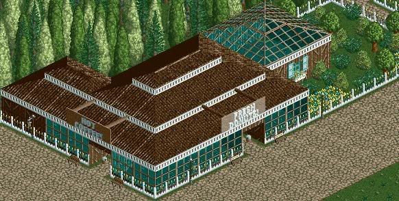
everything is WAY too dark.
like the roof's the windows even the benchs and the trashcans.
and remove the fences from the windows, and you have a enormus amount of trees and things back there.not fealing the flowers or the foliage either.
hope that helps.Edited by Nokia, 14 June 2008 - 08:51 AM.
 Tags
Tags
- No Tags

