(Archive) Advertising District / Dump-Place
-
 19-April 07
-
![][ntamin22%s's Photo](https://www.nedesigns.com/uploads/profile/photo-thumb-221.png?_r=1520300638)
 ][ntamin22
Offline
FK that is awesome. One of the best sculpture's I've seen.
I'm still working away on this. But tough with a mouse pad grrrrr.
Needs lots of refinement (like everything behind the windows) but its slowly coming together.
Why would you do this to yourself
all those fences
-

 FK+Coastermind
Offline
Pac, its a fantastic screen, and everything looks awesome as usual per your work, but i have to say i don't like the track. I don't really care if its accurate to some real life coaster, it just looks messy imo, and i think the train looks way over-sized on it. That is my only complaint.
FK -

 Corkscrewy
Offline
That's probably because I was drinking sailor Jerry. In which case I would agree with u
 -

 Louis!
Offline
Pac, are you still showing screens of Robbie's BGA and passing it off as your own? You shouldn't do that.
 -

 Sulakke
Offline
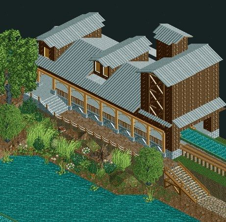
That building would look so much better with the normal wooden roofs. The ones you used are so lifeless. The structure itself is quite nice.
 -

 Louis!
Offline
On a more serious note Pac, I still think that Beemer track is uncessary. If this was a Premier, then I think it would fit, but not for an S&S
-

Disney Imagineer Offline
Pac, looking good! Great stream.
Austin, I love it man! I think the roofs might work if they had some color, maybe the forest green? -

 ar2910
Offline
Some more NCSCO, no-trainer work on the Magic Mountain scenario from me, just to show I'm still alive. The station of a rapids ride where 'Superman: Escape from Krypton' is/was normally located. I'm afraid it's unfinished. Comments/criticism welcome as always:
'Do not listen to her song,
Her gentle, haunting cry,
She wants you dashed upon the rocks,
The wicked Lorelei.'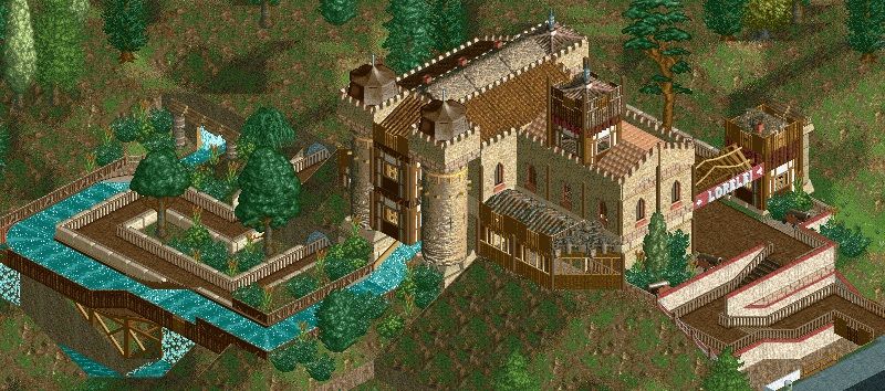
-

Disney Imagineer Offline
Looks cool! I like it a lot. Love the drop out of the castle and the path that leads up to the entrance. -

 Fizzix
Offline
I really don't like the rapids off of the ground like that, but everything else is excellent.
 -

 Roomie
Offline

Working on some new building designs. not sure on the far left one.
I was going for the old run down block of flats look. Any thoughts? -

 ar2910
Offline
Now, the one on the left, I actually quite like. The fact it took me a fair few moments to realise that you've used flowerbeds for the floors indicates to me that they work well. I know that this may be speaking out of turn, but it's the block on the far right I'm not overly keen on; the variation on window size/length across different faces seems to give the impression that the floors are mismatched heights, which, if you'll forgive me for saying, keeps offputting my eyes. Grand work overall though, especially with the central tower!
 -

 inthemanual
Offline
I really like the structure itself, I feel like it gives something along the lines of what you said you were going for. I don't like the roof however, it seems messier than the rest of it.
 Tags
Tags
- No Tags
