(Archive) Advertising District / Dump-Place
-
 19-April 07
-

 posix
Offline
Rob, no intention whatsoever to wise-ass lecture you. Where do you take that from?
I understand better now that 100% details always and everywhere really is your thing. I won't bullshit you by lying that I get a similar boon out of it. I don't. You know that.
I'm sorry if my post had a condescending tone to you. It was not intended. -

 leonidas
Offline
Robbie, that looks absolutely fantastic. I sometimes think NE is too driven by some communal nonsense image about quality, that they seem to be pushing through everyone's throat. Already when someone posts their first park, people start shaping them into what (for some reason) is considered 'right'.
I enjoy your artistry because of it's very individual vision and standpoint towards the usage of this game.
Which is a very virtuoso-kinda one. Where every detail of reality is taken deep care of, and thus shows your passion for the rich chaos that reality is, rather than to simplify it and render it into something more abstract.
I Appreciate your love for things as they are, with the notion that any concession wouldn't capture it's total complexity.
Stick to your believes. -

 robbie92
Offline
Posix, I think Leonidas got the right idea in terms of my work. It's not neccessarily about 100% detail all of the time, but I love how rich and chaotic real-life is in its detailed aspects, from the texture of a wall to the articulation of a building connection; it's what makes me never tire of even the most banal buildings. Therefore, rather than abstracting something to a basic "NE-standard" aesthetic purpose, I like it to seem slightly complex and chaotic at first look. I know that players like you and Liam like to abstract things down to their basic aesthetic aspects, which I think often looks incredible and is something I doubt I could ever acheive. I wasn't intending my response to come off as rude, I just think that my version of "balance of detail" falls along a different portion of your detail scale, hence my response being more along the lines of me sticking with my own aesthetic aspirations. I deeply, deeply respect the work you pull off, as evidenced by our many conversations about you, Shuessler, and Slob, it's just a style I doubt I could ever pull off without feeling disingenuous about is and the intentions behind it. This complexity-based style seems like the one that feels most true to me, hence why I continue on it.
Not that this matter much regardless, with that building being gone due to scale issues within the park. -

 Louis!
Offline
I would actually call the excessive detailing that you are fond of (not a bad thing) is the NE Standard, not this aesthetic simplicity you guys are talking about :/
 -

 Austin55
Offline
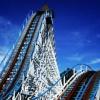
Are the black parts going to be tunnels?
A drop like that in the the bigger one would be insane IRL. -

Disney Imagineer Offline
Looks fantastic man. I didn't make it to the stream but I watched the whole thing last night, great stream. Love the coaster. I like the choice of train color too, its different but nice. Hopefully I'll make it to the next one! -

 hulkpower25
Offline
what you guys think about this tree, should they stay or be removed, i really dont know much about what tree, and where they will go corectly

-

 Mattk48
Offline
I'd say it needs more green at the moment. Some bushes would look nice. I see what your going for but that castle station would look better in a foresty area.
Nice layout Louis -

 Ling
Offline
@ hulkpower: less hiba trees, more pine trees, more underbrush.
And oh my god I am so tired of the GCI station fly-bys. I like the rest of the layout though. -

 Louis!
Offline
I've actually never done a station fly through, so I thought why not. Plus most GCIs have them. Also, station fly throughs in RCT rarely look good, and often look forced, this one doesn't so yeh, I love it.
#DATFLOW
sooooooooooo gooooooooood -

 Ling
Offline
I think it definitely looks like the most forced part of the design. I agree it could use another sweeping turn or helix or something instead. Too many long straight sections in the middle.
 Tags
Tags
- No Tags


