(Archive) Advertising District / Dump-Place
-
 19-April 07
-

 Sulakke
Offline
inthemanual: I love the foliage. Very asian!
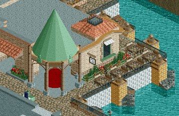
nin: Great screen, nin. I think you should remove some of those trims you used several times though. Right now it's an overkill. I don't like the holes with trees either. Holes in pathways are clumsy. -

 robbie92
Offline
inthemanual, that's quite nice. I really like how that brake run seems to swoop around the station.
 -

 robbie92
Offline
Some 1k ruins where the rocks are would help that immensely. Also, something I've noticed with your archy, you could use more niches and variation in the wall faces in your work; it'll make everything much more dynamic.
 -

 ScOtLaNdS_FiNeSt
Offline
Make the roof black and add some vents and shit. if your going for realism.
 -

 Fisch
Offline

ehhh just a dragon..
awesome! I love the dragon's face. What I dont like is the beginning of that wall. Don't think the colors match very well.
That is fantastic! By the way what is the object you used for that roof? I would love to use it for my park.
looks amazing really -

Disney Imagineer Offline
This looks so good man! Really giving me Disney vibes. Love it!
we choose to go to the moon not because it is easy, but because it is hard. -

 FK+Coastermind
Offline
Damn nin, u got working on that thing! Looks lovely!
This whole page is filled with win! Love all the work up in here!!
FK
 Tags
Tags
- No Tags


