(Archive) Advertising District / Dump-Place
-
 19-April 07
-

 gir
Offline
Yeah, I have.
It doesn't kill the ride.
It's better than having a mid course brake run there.
It's pretty boring, I agree, but doesn't kill the ride.
There is no need for an MCBR there, it's not like it's an alternative to one. And if you've been on it you'd know there's no airtime. I don't know what compels B&M to do things like this to their rides, but I don't see why you should settle for this in RCT when you can do so much better. -

 Comet
Offline
Correct, there is no airtime.
But that's where B&M would normally have a MCBR. However, since Top Gun has such a short layout there was no need for one. It is sort of a nice way to make a transition from the first half to the second half, imo. -

 FK+Coastermind
Offline
Sure, your building is awesome looking, and it works great the way it is placed as a deco art creation sort of thing, but if you want to use it, it needs to stay as art. its way too detailed and has too many pieces to it to stand as a functional building. its nice, but your whole park cant look like that. buildings need to be more simple.
FK -

 Carl
Offline
That looks a little symmetrical, but maybe its cause im a little square
Seriously though, for the style of archy you were going for, I think its pretty good. -

 nin
Offline
Show a finished screen building like that and I will be impressed.
same here. It's nice and all, but it's not a challenge to create a building with that amount of detail, it's a challege to create several buildings with that amount of detail. -

 Bernts_matte
Offline
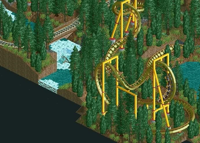
Havent play so much RCT2 lately, but now summer is comeing
 and with it much freetime for RCT ^^
Well heres some from my lates park
http://img338.images...orldwip2qq8.png
 Tags
Tags
- No Tags


