(Archive) Advertising District / Dump-Place
-
 19-April 07
-

 Ling
Offline
I think the structures look great, but otherwise it's simply very boring. The landscaping is good but it needs something else there. Something to break up the brown.
 -

 Austin55
Offline
Fantastic stuff on the last few pages everyone.
FK-Maybe some foliage and diversity of textures in that landscape? -

RMM Offline
but.. that doesn't comply with the unwritten rules found in the RealismCT handbook.
how does one find unwritten rules in a handbook?
.... hehehe. -

 FK+Coastermind
Offline
Thanks erbody! yeah, its i'm pretty much trying to get all the structural elements down first (i.e. triple custom mountain) and then i will add some more details on top. I'm very wary of abusing textures and foliage, considering Karizima.
FK -
 Mattk48
Offline
I'll throw my two cents in
I agreeWith some minimal foliage it'll be perfect.
Good luck supporting that, looks like it's going to be bitch. />
/>
Nice screen, I'm just worried about the finished product being too dark. -

 FK+Coastermind
Offline
urm, it is definitely going to be dark. That is what i'm going from, but don't worry, it will be tasteful dark, not drab dark...heh
FK -

Airtime Offline
Just collecting the last few pages...
I like the colours in this screen, it has quite a nice atmosphere. I think the supports are a bit square when they join the track. Will be interesting to see how good this layout is. I do like a good layout and I'll be highly criticalNot perfect by any means but I've really been enjoying this one. If nothing else, I am pretty convinced I've got one of the best giant-B&M-invert layouts ever created!

 />/>
/>/>
It's good stuff! You show a lot of promise. I think you build with a lot of the smaller objects that have no texture, try and use some objects that have texture. Different land textures will also help that screen like grass and cluster some of that foliage under the trees. I love the flower arrangement but grass underneath will really bring it out.coasterfreak, I really like the clean look you've got going on here. Looks really nice. But I agree with FK+coastermind, the theme isn't clear enough. The architecture looks western-styled, yet the coaster is the complete opposite. However I do like the architecture, its neat and clean. What's the theme of the coaster? Could make sense if it were Cowboys vs. Aliens or something.
 />/>/>
One thing I really don't care for is the gray stone retaining wall behind the coaster, that slants with the terrain. Kinda brings the beauty-level down IMO.
I look forward to seeing more of this one!
Edit: Something I've been working on...taking a break from Anheuser Village to work on a fun side-project.
Disney Imagineer: I like the clean lines and general 'tidyness' of the structures. They appear to be just the right scale and simplicity. I'm reminded of state fair pavilions, if that makes sense?
All the recent NCSO activity has made me want to play the game 'out of the box' again (plus the trainers and their zero clearances option, useful as they are, often tend to frustrate the buggery out of me)! So here's a couple of screens of a new Mexican/central American themed entrance I've been building on the Magic Mountain scenario:
The park entrance building, which contains guest services, toilets, a seafood restaurant and terrace called 'Palacio de la Paella' and a dark ride named 'Valajoe's Mysterious Voyage'
The entrance plaza, ticket booth with retractable awning, and park exit.
I hope it's apparent both screens are unfinished.
Comments/criticism welcome.
Wow dude, stick around, great to see more UK residents on the forum. These scream Kumba to me. My only dislike of the screen is I don't like how large the ticket sales queue is, I'd generally on use 1 tile for a queue for tickets. Also use 8cars to get rid of the park boarder, makes it look cleaner. Also don't forget grass underneath some areas of foliage, it's not all sand.
Haha, I have this image saved on my computer as well which I often come across. Shame your not building on this RMM.Great stuff RMM, you should finish this.
edit: Oops, didn't realise this is an old post.
I'd still like to see it.
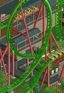
unfinished, particularly the supports, but I'm really happy with this part of the design!
FK
Great to see more of this! I love the mountain interaction and the way it follows the landscape. I really like the brickwork although I think a touch of colour in there somewhere with either the coaster or brickwork will do it well. -

 Six Frags
Offline
^If possible I'd use Kumba's B&M connector piece to support the big loop a bit more, as you're going for realism. I also think the original station should be hacked invisible..
Otherwise it looks nice, great color scheme and I love the height variations. -

 Steve
Offline
Really great placement for that loop, looks awesome. Station looks great too, but the piece of track glitching into it should probably be given some more room to breathe. Maybe try an actual path texture for the queue too?
 -

Disney Imagineer Offline
ar2910: Thanks man, I appreciate it!
Airtime: Thanks Airtime, will definitely try out that suggestion. I've added grass before and I think you're right, it would make it pop more. Thanks for the kind words. Will try using different textures as well.
Maverix: That screen is beautiful! Unique choice of colors. The station/queue structures, foliage, and support-work look great. Keep up the good work! -

Airtime Offline
Mav, wow, love it. The only thing I'm not sure about is how low the support placement is on the loops, can't you get them a bit higher? -

 Kumba
Offline
I have always been surprised that connector never really caught on. I think it's only been used in two releases, SoK and Terra Progressia. Would be nice to see it used more. It was hell to make, I mean Toon gave up on it due to what a bitch the views on large loops are.^If possible I'd use Kumba's B&M connector piece to support the big loop a bit more, as you're going for realism
Very nice work Mav and that NCSO works is great. Reminds me of SA's staff and that's something I don't say often.
 Tags
Tags
- No Tags


