(Archive) Advertising District / Dump-Place
-
 19-April 07
-

 Dark_Horse
Offline
Normally I don't like ground hugging curves taken at high speeds, but have you thought about flattening the curve after the first loop and using the steep slope pieces on the dive loop? Otherwise, layout looks pretty good, nice interaction with the landscape and path/theming.
 -

 Chrixz
Offline
Normally I don't like ground hugging curves taken at high speeds, but have you thought about flattening the curve after the first loop and using the steep slope pieces on the dive loop? Otherwise, layout looks pretty good, nice interaction with the landscape and path/theming.
Thanks, also about the steep pieces it looks much better and I got better ride stats too.
-

 pierrot
Offline
love the gate and wall details, the foliage seems bit random though. how's the progress?
 -

RMM Offline
anybody know if there's a way to create custom objects for rct2?
i mean, LL has codex. surely, some of the minds here can come up with something. -
 Mattk48
Offline
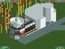
The grey part of that building has very little detail, add some more, make it more interesting. that coaster need custom supports and a space themed statue or some planters would do wonders for that path
 -

Airtime Offline
Jonny93, awesome stuff. Absolutely love it. You're becoming a really strong parkmaker! -

 FK+Coastermind
Offline
We will be the judge of that!
but no, if you think you have a killer design, don't let it get slagged off due to poor surroundings. THe supports, IMO, are alittle odd. i would def switch to the round footers made for those supports. If they are really tall then you can but brick pieces as the very base foundations (i've done that and think it looks awesome). Also, your archy, while not bad by any means, could use some more color and some more creativity. Right now its too bland and theme-less. What kind of park is this? give us a theme of some sort!
FK -

 SoCalCoasters
Offline
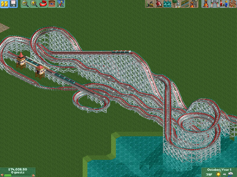
Been experimenting with random layouts again. It's a Travers inspired woodie with RMC twistiness.
-

 Ling
Offline
I like most of it, but I'm not digging the two long straight sections in the middle/late part of the ride. Even if one of them is all twisty. It's just a bit repetitive.
 -

Disney Imagineer Offline
coasterfreak, I really like the clean look you've got going on here. Looks really nice. But I agree with FK+coastermind, the theme isn't clear enough. The architecture looks western-styled, yet the coaster is the complete opposite. However I do like the architecture, its neat and clean. What's the theme of the coaster? Could make sense if it were Cowboys vs. Aliens or something.
One thing I really don't care for is the gray stone retaining wall behind the coaster, that slants with the terrain. Kinda brings the beauty-level down IMO.
I look forward to seeing more of this one!
Edit: Something I've been working on...taking a break from Anheuser Village to work on a fun side-project.
-

 ar2910
Offline
Disney Imagineer: I like the clean lines and general 'tidyness' of the structures. They appear to be just the right scale and simplicity. I'm reminded of state fair pavilions, if that makes sense?
All the recent NCSO activity has made me want to play the game 'out of the box' again (plus the trainers and their zero clearances option, useful as they are, often tend to frustrate the buggery out of me)! So here's a couple of screens of a new Mexican/central American themed entrance I've been building on the Magic Mountain scenario:
The park entrance building, which contains guest services, toilets, a seafood restaurant and terrace called 'Palacio de la Paella' and a dark ride named 'Valajoe's Mysterious Voyage'
The entrance plaza, ticket booth with retractable awning, and park exit.
I hope it's apparent both screens are unfinished.
Comments/criticism welcome. -

 Casimir
Offline
in before "ZOMGOSH THE OVERUSE OF TRACKITECTURE"
That's actually no-ZC-stuff, eh?
Rather impressive, although it could need some color contrasts. -

 ar2910
Offline
in before "ZOMGOSH THE OVERUSE OF TRACKITECTURE"
That's actually no-ZC-stuff, eh?
Rather impressive, although it could need some color contrasts.
Thank you. It is all non-ZC. I'll go back and re-tweak the colours a little. The 'car ride' tracks on the park entrance building are part of a functioning ride rather than trackitecture. Thanks for the comments people! I thought it was rather mediocre, almost considered not posting it.
 Tags
Tags
- No Tags


