(Archive) Advertising District / Dump-Place
-
 19-April 07
-

 pierrot
Offline
yeah SFSF was immense, but I still much enjoy with Park Edda, Rangda and Congo. please do more theme.
 -

 Fizzix
Offline
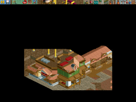
I like how that double railway looks in the context.
---------------

"It's the hub of the world, you know? Boats, ships, submarines... All leading out to every corner of the world. A man can leave here and experience everything you'd ever want to discover, and anything you wouldn't... All you gotta do is just pick a dock and set sail!"
Bringing it over. Amazing work. Almost exactly what I was trying for in the Jules Verne section of the Classic. Would love to see more. -

 Steve
Offline
I've never said this before, and I mean it with love, but I am not a fan of this, robbo. I feel like there's just so many textures and weird custom objects that it comes off as a big mess. Also not too fond of the foliage or rock landscaping. I know you can do better than this, dude. I do like the form of some of the buildings and the custom riggings are sick, but it just lacks the harmony I've seen in like every other thing you've built.
 -
![][ntamin22%s's Photo](https://www.nedesigns.com/uploads/profile/photo-thumb-221.png?_r=1520300638)
 ][ntamin22
Offline
I'm working on a series of pie charts
% of screens showing an incomplete entrance to a park
% of topics starting with said screens
% of of parks beginning this way which will never be completed -

 Wanted
Offline
I've never said this before, and I mean it with love, but I am not a fan of this, robbo. I feel like there's just so many textures and weird custom objects that it comes off as a big mess. Also not too fond of the foliage or rock landscaping. I know you can do better than this, dude. I do like the form of some of the buildings and the custom riggings are sick, but it just lacks the harmony I've seen in like every other thing you've built.
Agreed -

 gir
Offline
Interesting! I get a bit of a BioShock vibe from it, I guess because of the colors and obviously the maritime theme. Incredible stuff man.
 -
 zburns999
Offline
Robbie, I love it all except for the brick building at the end. It just feels like one too many textures. Also, bonus points for the PT2 bench. The chances that this will be finished one day have risen exponentially simply because of the bench you chose haha.
Also, we all kind of missed Whitehawk's awesome screen up there. What would otherwise be nothing special is made awesome with some ride interaction. Great screen, man. -

 nin
Offline
Whitehawk, I think your coaster could use better colors.
Robbie, the screen is great, as you know. It's a bit random, yes, with this pseudo-Verne theme going on, but nonetheless it proves that you don't really need this hyper-detailism that is so prevalent these days. PT2 era, ftw! -

 Nokia
Offline
I like how that double railway looks in the context.
---------------

"It's the hub of the world, you know? Boats, ships, submarines... All leading out to every corner of the world. A man can leave here and experience everything you'd ever want to discover, and anything you wouldn't... All you gotta do is just pick a dock and set sail!"
turtle chic -

 gir
Offline
I don't really get it...too many textures, colors, objects...no cohesion whatsoever.
I think you need to slow down, figure out the right form of the building, and then add details later. I'd guess that you're trying to do it all at once. -

 SoCalCoasters
Offline
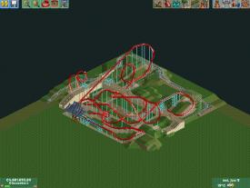
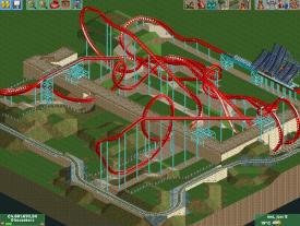
^I like it! The only thing layout wise I'd maybe change is making the approach to the dive loop a double up. It may not be quite as "traditional B&M" but it would look cool!
 -
 Mattk48
Offline
The beginnings of that station looks cool. I like it, but its basically just a layout, not much to comment on. If your basing continuing this project or not just of these comments, then I say go for it
 -

 Chrixz
Offline
The beginnings of that station looks cool. I like it, but its basically just a layout, not much to comment on. If your basing continuing this project or not just of these comments, then I say go for it
Sorry if I was a bit unclear in my previous post, ofcourse I wil continue my project. I just wanted some feedback for the layout, but i'm glad you like the station although it's not much.
 Tags
Tags
- No Tags


