(Archive) Advertising District / Dump-Place
-
 19-April 07
-

 In:Cities
Offline
Not to argue one over the other, but just commenting that i am very much the other way around. Usually i won't know what i want to build until i start building. Once i have gained an idea of the direction i want to take things, than i can start doing more extensive planning. When i do get ideas i usually make a mental note and am quick to try them out. FK
Thats how I used to be for the longest time, but I feel like I've progressed more as of late and this is what helps me stay on track and build. Plus, it really helps me avoid the creative 'roadblock' that I seem to hit during each project, because I actually know what to build next:]
To each his own though.
This seems to suit me better because I have a job where I am able to draw in my notepad quite a bit while on the clock, so being able to plan things out while not at the computer is a fun task for me to do while at work lol. Not to mention that I am planning on starting school again next semester and am going for Graphic Design and Architecture/Drafting.
Disney is going to help me with the educational reimbursement program, so I would like as much practice as possible. Even if it is planning RCT2 parks haha. -

 gir
Offline
This is the worst excuse I've ever heard...please just be honest with the community.Thanks for the words cocoa, i check the link and i really dont care what you think. i was working on this park for the last year, and lost it, and started working on it again from scratch.
-

 Louis!
Offline
Someone copied something...rawr rawr rawr...
who actually cares? They both look great!
(obviously give credit where credit is due though) -

 Pacificoaster
Offline

I am sure both got inspiration from this rentals structure at Islands of Adventure. -

 AvanineCommuter
Offline
Silly people. Both are recreations. Now you all look like douchebags. Good job.
-

 gir
Offline
I don't think there's any question that they reference the same source material, but I also don't think you get some of the details so similar either. It's like playing one of those "What's Different?" games.
 -

Airtime Offline
I personally think both are out of scale. In fact the buildings Pac showed would look far better being about 4 or 5 tiles wide at a maximum and no where near as tall. These style of buildings are sort of perfect for the style of 5Dave, Cocoa and Dimi. The sort of slightly messy but awesome style.
Coupon, I really like that and I can't wait to see the full release. I love the little ticket booth windows touch with the 1k sign. -
 Mattk48
Offline
What if you made the blue a tan/ light orange color, and the yellow awnings a light blue. Then the white orange .
Hard to picture in my head, but I think that would make it look more like a Disney Hollywood studios building -

 Cocoa
Offline
dark horse: its certainly an improvement, but maybe choose a less sickly shade of blue? perhaps turqoise? Also consider the style of buildings that you find in main street. Yours is a lot of square glass windows in a square layout with a square roof. There should be lots of crown moulding, roof details, 'classy' sort of windows and balconies and whatnot. Yours still looks like a (much brighter) headquarters for some industry. Like a building you would find attached to a big warehouse.
 -

 In:Cities
Offline
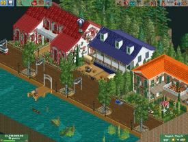
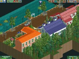
Tabard, thats really really good! A little too square, but definitely not bad. Foliage is a little messy.
Welcome to NE! -

 inthemanual
Offline
Thought I'd share some things that were really fun for me to make. Sorry about the weird fuzzy edges, I was trying to be clever, but just failed with MSPaint.

The crowds are also awkward and ugly, I random handymen on the beach that I need to remove, and the colors seem to have gotten altered slightly somewhere between RCT, my VM, and paint. -

 Dark_Horse
Offline
So I am kind of curious, why does everyone keep thinking my building is supposed to be on Main Street USA? Pretty sure Disney has other theme parks besides the Disneyland style ones.
Tabard, that looks great and welcome. I like the balcony on the red roof house. It helps break up the symmetry and gives the structure a bit of depth.
Inthemanual, I love that second screen. Looks like a real mini golf course. Great work.
 Tags
Tags
- No Tags
