(Archive) Advertising District / Dump-Place
-
 19-April 07
-

Disney Imagineer Offline
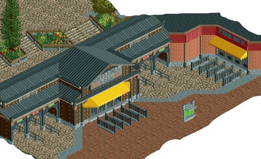
I like the shape of the building. Not crazy about the black wood pieces up top, or the green lattice fence along the top. I don't really care for the paths, either; I would choose some different ones. And it's a lot of black. I like the brick columns lining the front sides, I would just make them a different color. I would probably make them tan, but then you would have to change everything. -

 Cocoa
Offline
definitely the colors need to change. bright, warm colors, look at highball's disneyland for clues as to how to color. also, red brick paths is pretty standard. definitely put tables or racks of souvenirs on the inside too. It also needs something defining architecturally. I would have put something above the diagonal bit, like on the building to the left here:
https://encrypted-tb...EXMJd2NMIoPmoug
if you're seriously trying to emulate disney, definitely definitely try and copy some real buildings as exact as you can. -

 nin
Offline
Hulkpower, that is seriously some of your best work, if not THE best work you've done yet. It looks like you're planning this one out a bit more than usual.
Dark_Horse, listen to Cocoa. You're [slowly] getting there, but I think your best bet is to replicate more from real life, teaching you techniques in return. -

 Dark_Horse
Offline
Thanks for the tips. I will definitely consider them. For anyone that is curious, I actually did base it off a real building, the Floral Depot in Los Angeles. After looking at how Disney actually dealt with the colors, I see what you mean about lightening it up.
 -

 Xeccah
Offline
Thanks for the tips. I will definitely consider them. For anyone that is curious, I actually did base it off a real building, the Floral Depot in Los Angeles. After looking at how Disney actually dealt with the colors, I see what you mean about lightening it up.
Dark, look at that building again. The reason why your screen was so dark was because of the green awnings; also the inspiration you posted shows some wood and stuff to lighten down the black. -

 disneylandian192
Offline
In the end what you'll find is that Disney picks buildings in real life to replicate that in their own right already have a Disney style to them. Any brick used is a natural red, tan, or brown, never black. Also think about the era you're trying to create. Disney would pick classic examples of period archy, something even the rl building you're basing off of doesn't seem to hold. For a Disney Studios park, think 20s to 50s style. Classic emergence of strong art deco design. Look for popular examples of this archy style and you'll find that Disney flavor too.
 -

 Ling
Offline
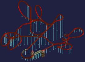
I don't like the entirely flat S-bend after the first corkscrew, but other than that the only thing I think I'd change would be the banking on the pre-drop at the top of the lift.
 -

 FK+Coastermind
Offline
Not a huge fan of the Cobra, it seems SOO oblong and weird. I would drop the whole element lower and use the large loop half pieces with corkscrews. Otherwise, the whole thing looks good, if not generic B&M...
FK -

 Xeccah
Offline
If he was going for the cobra ( and path interaction ) in MRR, then this would be the way to go.
 -

 Corkscrewy
Offline
nin. I think it's a great solid layout. my only thing is it may seem a tad short after the mcbr. maybe add a helix in there somewhere? or some more just hills and turns?
 -

 gir
Offline
So those aren't large half loops? RCT2 confuses the shit out of me.Not a huge fan of the Cobra, it seems SOO oblong and weird. I would drop the whole element lower and use the large loop half pieces with corkscrews. Otherwise, the whole thing looks good, if not generic B&M...
FK -

 BelgianGuy
Offline
it's good technically coupon but it's so sterile... doesn't look inviting at all tbh
 -

 nin
Offline
gir, it's a flat-to-vertical, followed by a quarter loop. I can try using large loops instead.
 Tags
Tags
- No Tags
