(Archive) Advertising District / Dump-Place
-
 19-April 07
-

Disney Imagineer Offline
I would also use a different awning. Fisherman's set would work perfect here I think. Nice job though. -

Disney Imagineer Offline
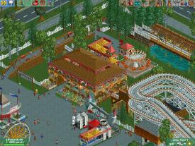
I like it, RCTER. The coaster is probably my favorite part about it. I love the trellis' at the top of the coaster, nice detail. A little unsure about the town part though. Seems a bit too cluttered or something, and I probably would've used an invisible park entrance so it wouldn't be as cluttered (but I understand why you didn't, since its NCSO). -

Disney Imagineer Offline
A lot of colors. lol
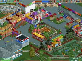
(looking at the first screen) All the colors kind of make it a little too crazy and silly. You don't have to use every color in the color palette (I did this once and its a bit overwhelming and unnecessary). Not that big a fan of the eating area because of it being on grass and its surroundings (not that pretty of a place to want to sit down and eat, near junky flat rides). It's too chaotic of a scene I guess for guests to sit down to try to enjoy a meal (even if its not supposed to be high-end). So I would probably try to relocate this eatery somewhere else or reorganize that section better so guests can be in a separate area from the hustle and bustle to eat. Also never really cared for the wooden walls you used on the ICEE building (or if anyone uses them, TBH). They don't look good colored. I think it makes any park look dated.
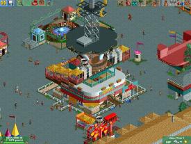
The third shot is probably my favorite because the structure is pretty cool. I would add an awning covering to the rides near it though and I think it would be better. Fisherman's awnings would be perfect for your park!
There's also a lot of pavement in the third screen. It's almost like your rides are either too close to each other (like in the first screen) or they're too spread apart (the third screen). Maybe find a middle-ground and bring them within the same area, just not too close and not too far apart.
Hope this helps some. Not trying to insult you, just trying to tell you things I think could help make it better. Overall I would just be more careful with what color you make something. Alternating between the color palette frequently (like along the top wall in the first screen) just doesn't look that great. Also space some things out (first screen), and bring some things in closer (third screen).
-
 RCT2day
Offline
Seems a bit too cluttered or something, and I probably would've used an invisible park entrance so it wouldn't be as cluttered (but I understand why you didn't, since its NCSO).
It's not NCSO, there are a few custom roofs and that crazy glass helix thing. But I agree that it is cluttered, perhaps because it's a Monthly Micro? -

 RCTER2
Offline
I used a workbench of RCTSpace and it's not NCSO.It's not NCSO, there are a few custom roofs and that crazy glass helix thing. But I agree that it is cluttered, perhaps because it's a Monthly Micro?
-

 RCT2day
Offline
I used a workbench of RCTSpace and it's not NCSO.
Don't get me wrong, I still think it's good. -

 Ling
Offline
I don't like the grass overlapping the train tracks. The interaction there is pretty cool, though. I see some vertical landscape faces that are colored for ice that shouldn't be.
 -

 hulkpower25
Offline
Here is something i just started working again,after loosing a project i had being working for the last year.
Ioa Dubai
-
 JJayMForce
Offline
Sorry to hear about your lost project hulkpower. Your last screen looks great dude, I love it.
 -

 Liampie
Offline
You lost it? Damn shame! This new project looks like your best work yet though. Love that building.
 -

Disney Imagineer Offline
I don't care for the baby blue with the bright yellow (or the black and white either), but as a whole the entire thing is great. Great start. -
 Dark_Horse
Offline
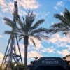
Working on my architecture. I still feel like this belongs in a Six Flags park and not a Disney park. Any suggestions?
The Darkroom at Disney's Hollywood Studios (not a recreation)
 Tags
Tags
- No Tags


