(Archive) Advertising District / Dump-Place
-
 19-April 07
-
 Corkscrewy
Offline
holy crap.. that jurrasic park mural .... wow..
who else is excited for number 4 to come out!!?? -

 Liampie
Offline
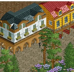
No to the blue/white flowers (so cold), yes to the plofkip. You're so full of good ideas! Can't wait to see more bird related things in your park.
 -

 Casimir
Offline
I hear nin has a Jurassic Park fetish. And recently, and In:Cities fetish as well.
I hear nin actually manages to finish something now.
Oh. No wait. I didn't hear that.
-

 Faas
Offline
A plofkip is a chicken that is force-fed to assure we have cheap chicken. In the Netherlands all activists are whining about it. I for one love the fact that my chicken is cheap.
 -

 Faas
Offline
Very cool Brunooo. I'm not sure about the purple flowers though. I guess they are a 'hate it or love it' kind of thing. Also try to break up the path with something small.
 -

 FK+Coastermind
Offline
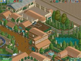
I have to say, i love that circular section. Looks awesome. Overall, this could use some color, just some accents. Also, maybe try to incorporate similar circular elements.
FK -

 Ling
Offline
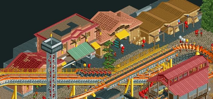
It's very... boring. Too much brown. You might be able to introduce some color with canvas path coverings and either grey tarmac or crazy paving for the paths. Colored fence details/building layers would work too. I'd use something like the steel or corrugated blocks for the roof since the guests won't see it and it introduces visual variety for the viewer. The roofs on the shops and station are a bit awkward, particularly the long rounded one, but I couldn't really give you any specific pointers to improve it.
 -

 Brunooo
Offline
I'm working on a small park at the moment so i don't think that will take very long to finish. I'm also thinking about doing a design but i don't have any inspiration and i have to improve my coaster skills.Bruno, you need to finish and submit something.
 Tags
Tags
- No Tags


