(Archive) Advertising District / Dump-Place
-
 19-April 07
-

Airtime Offline
And to quote my self from what I said in that topic:The only things that I would consider acceptable when using custom scenery in a NCSO park are the clear path, black tiles and the clear park entrance to give the park a clean feel.
Yea NCSO is a style but if you start mixing in CSO it's more oldschool stuff or RCT "Vanilla" or whatever it's called. -

 Fizzix
Offline
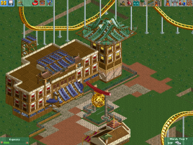
I feel like the abstract fences are out of place on that building. But other than that, I enjoy it.
For the record, to me, NCSO means nothing that wasn't originally in the game. Of course, I put the invisible entrance on my current project, so I don't know haha. -

 FK+Coastermind
Offline
I'm with Airtime here. Part of the allure of NCSO is that you made what you made without the tools most of us consider so essential to the game. Therefore, to call something NCSO you should have only stuff that comes with the game. Thus, if you are going to do some old-school rct styled parkmaking, just call it that.
I tend to treat NCSO like a description of the park, not a style. In architecture your building can be LEED certified for being green. You can build a sustainable building, but to be LEED certified it has to meet certain criteria. I feel that NCSO is like a certification that you used no custom scenery, regardless of style....but that's just me.
FK -

 Corkscrewy
Offline
I kind of agree honestly. Like my park Atlantc Adventures is completely ncso and no 8cars. That being said that's why I made a topic about my new park and what's considered ncso. Like if using the invisible path was considered. That's really the only thing I'm using. Well that and custom flats by amazing earl or different cars for rides.
 -

 Milo
Offline
not sure why everyone is jumping on the pedantic and negative bandwagon here
keep it up Shotguns -

 gir
Offline
Might be better to stick to one wooden coaster roof color (ie all purple or all green), at least for that one structure.
 -

 disneylandian192
Offline
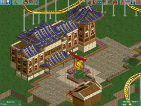
I think the screen overall is great, but the rooves are indeed a tad messy. Try adding the monster truck track on top of the wooden track, helps add a little bit of cleanliness.
 -

Disney Imagineer Offline
I think what makes it look "messy" are the paths. You can see grass where you shouldn't see grass. Also, the clocks you used as footers for the Japanese arch aren't lined up with the poles. Although I really like the arch itself, I don't think its necessary having the yellow/tan track inside the yellow ball. Also I think if the building is a coaster station, it could benefit if it were a bit more open and not so closed off. The tiny windows aren't enough. I think doing these things would help. -

 Cocoa
Offline
I think part of the problem is that japanese aesthetics are very particular, especially in terms of building layouts, paths, foliage, etc. There's a great deal of thought that goes into laying out Japanese parks and a lot of meaning to where certain structures and objects are placed. Kitabasaki Dragonland did a pretty good job at interpreting Japanese aesthetics, while this has not. the building has an awkward layout, the paths are different textured and messy, there's a [fuck, can't remember the name, the thing with the big yellow ball] for no reason in the middle of the path (btw, what is the big yellow ball anyway?), no foliage to speak of, no landscaping work. it feels very un-japanese, with the only thing making me think otherwise being the wall textures and rooves (which are not really very japanese colors, but I'm a bit of a color 'exaggerator' myself, so I can forgive that
 /> )
/> )
some ideas/inspiration for japanese aesthetics: https://encrypted-tb...0BGAEMfWGvSppzY
http://www.premierph.../photos/734.jpg
http://2.bp.blogspot...00/DSC01451.JPG
http://us.123rf.com/...e-over-lake.jpg
hope this helps! -

 chorkiel
Offline
I sometimes feel you're trying to hard to fit in with a style. You don't just inspire yourself by a style but it looks more like you're forcing yourself to make something fitting in that style.
I don't really like this screen because it looks just like forced creativity for the mere purpose of showing that you can do NCSO as well. It looks like you didn't put much thougt in the building and added scenery just for having more details / potential ideas.
It's actually weird how this NCSO thing isn't working for you as your best work came from your classical/traditional building phase. -

 Corkscrewy
Offline
I agree. But to make it look better in my opinion I'd change the coaster track to the faded red color. More of an Asian feel. Still, it's a very square building for Asian architecture that is.
 -
 Mattk48
Offline
Around the top center of that building there are eqyptian walls stacked on top of each-other. switch them out for something else, they don't look right there. Also your roof doesn't cover the the top of the building, there's still wood showing
 -

 Cocoa
Offline
it still doesn't work because the building just doesn't work... what is it's purpose? its offset strangely from the path (it looks like a government building or something??) except the lawns are tiny and non-landscaped. there is no surrounding atmosphere and scenery for the building to make sense in. and that little hut looks terrible too. sorry
-

 Xeccah
Offline
Its supposed to be a large resturant but looking at it it someone could think it's an inn as well.
 Tags
Tags
- No Tags
