(Archive) Advertising District / Dump-Place
-
 19-April 07
-

 Louis!
Offline
Steve is now the official 'Best NCSOer'
Never have I seen the game look so beautiful, with or without CSO -

 Austin55
Offline
JDP I love you, but his archy isn't nearly this good. That's amazing Steve. I suspect we will see a huge trend of NCSO over the next few weeks.
 -

 chorkiel
Offline
Steve, you should consider, like, finishing something, or so. Seriously, you're a legend. It's beautifull.
 -

 Liampie
Offline
Can we see the H2H4/H2H3 movement that everyone was talking about, not NCSO -_____-
I would like that too, but this is a step in the right direction, right?
Steve I like it. It's obviously a v2 of your entrance in the Kodiak Project, and personally I like this one better. The flowers add a splash of colour that lacked in the previous version.
Looking forward to seeing more of this. Maybe get a topic. -

 Steve
Offline
I wanted to, but I can't find out how to get 8cars running with my new setup and trying to build so detailed without AT LEAST zero clearances would drive me up a wall. I'm going to try sticking this out for now, since I don't feel obligated to use hacking at all with no custom objects, ahaha.Build on the CS version of this entrance; it looked way cooler and had some cool coasters involved.
 />/>
/>/>
Thanks everyone!
ha, nice nin. -

 posix
Offline
That's wonderful Steve. The way it should be.
Think the barrels and other theming object on the rooves are too forced and look wrong though. The entrance looks fine to me. It's just native to the game. Don't waste your time hacking on such an unimportant detail. Your magic unfolds in your ability to transfer classic LL aesthetics to RCT2 with almost no loss at all.
Also great to see someone actually playing on a Mac. -

 Steve
Offline
I was thinking the same thing about the barrels, posix. Good call, I think, and thanks!That's wonderful Steve. The way it should be.
Think the barrels and other theming object on the rooves are too forced and look wrong though. The entrance looks fine to me. It's just native to the game. Don't waste your time hacking on such an unimportant detail. Your magic unfolds in your ability to transfer classic LL aesthetics to RCT2 with almost no loss at all.
Also great to see someone actually playing on a Mac.
-

 RRP
Offline
Looks ok steve.Looks more like a backstage area than park entrance though.Why is there a fence separating the left and right hand side of the paving?
 -

 Steve
Offline
Thanks RRP. Well I put the fence there cause I want this to have peeps in the end and I didn't want them getting more lost than they have to be once I let them in, aha. I suppose I can just delete the fence and have the path stay separate. I agree it does look a little backstage-y right now but I think once I put in more surroundings it should rectify that, I hope.
 -

 zburns999
Offline
Awesome stuff, Steve. Your usual style shines right through; it's barely evident that you're only using NCSO objects.
 -

Rhynos Offline
I was playing with NCSO WAAAY before anyone else was.
/hipster
Anyway, I like playing the scenarios and seeing what I can make with what the game gives me with said scenario. Currently, I'm working on Bumbly Bazaar and have only mostly completed the area around the coaster "Dry Gulch Desperado" as seen in this pic.
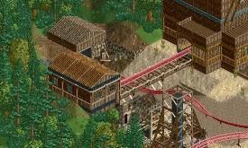
I'm not at all comfortable with foliage. I'm never quite sure what should go in the area in order to complete the scene, so bare with me. If you do have any tips on foliage, please lend me your knowledge as all I'm going on was "what would a deciduous forest appear like to me if I were in this park?"
TL;DR: This is NCSO; it is built/played with only the themes or rides given; foliage is not my forte.
Also, can I change my name to "Lamb of Jihad"? Prease? -

Felipe// Offline
Beautiful screen. I think foliage is nice by the way, maybe more bulrushes and junk in the limits of the forest and it's done to me. -

 zburns999
Offline
I love that building in the back half of the screen with the wooden debris laying around. The use of that rock wall piece is perfect.
 -

 Steve
Offline
Seeing that screen makes me wish I could use 8cars. There must be a way...
Great work though dude. I love how the rock wall looks too, as zburns said.
 Tags
Tags
- No Tags


