(Archive) Advertising District / Dump-Place
-
 19-April 07
-
 RCT2day
Offline
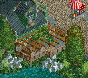
Not a fan of the supports but the architecture is fantastic, especially that station.
 -

 Corkscrewy
Offline
u know my feelings on this. buuut how about we dont show every new addition
gotta have something new when people open the park. haha -

 Liampie
Offline
Except for the horrible tree selection and glitchy roof that's a magnificent screen, Coupon.
 -

 Louis!
Offline
There's a glitchy roof? Looks perfectly fine to me :/
Amazing screen Coupon. Tree selection looks brilliant to me, the details are spot on too. Certainly the player to be watching this year. -

 Liampie
Offline
I removed the screen, and your guess is wrong. Your guess was the closest though so I declare you the winner.
 -

Wicksteed Offline
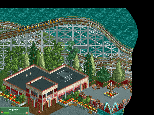
really tasteful architecture! not sure if the tarmac base blocks in the seating area contribute to the atmosphere though. -
 ScOtLaNdS_FiNeSt
Offline
Nice ncso. My only concern is the size of the 1st drop. judging by the size the coaster wont be very long.
But thats irrelevant really. I like how it looks realistic without being ultra.
Good job. -

 Corkscrewy
Offline
You'll be surprised by the length of the coaster
 and as far as the seating areas path yes. I was thinking of changig it to brown. Ill play around with the colors and see what fits. My whole point to this screen was to try and make a clean NCSO building. And I really do love it which is why I had to share it with you fine folk.
 Tags
Tags
- No Tags
