(Archive) Advertising District / Dump-Place
-
 19-April 07
-

 FK+Coastermind
Offline
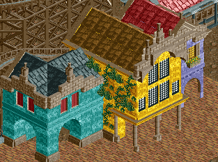
windows on the first floor would help. Also, maybe play wiht some differing textures. I like what you have, but everything is that same much tile.
FK -

 Ling
Offline
I'm not sure you need windows on the first floor, but I feel like that half-tile space between the teal building and they yellow building needs something around it. Like a canvas or roof trim or some planks to make a small latticework canvas. I'm not a huge fan of the colors, but I think they give a relatively accurate representation of the kinds of colors you see in amusement park architecture. One more wall type would probably be good, though. Perhaps the brick you have at the top of the facades, or the little corner deco brick objects here and there (if you have them).
 -

 Louis!
Offline
It needs to look like a building. That's my issue with it, it doesn't look real, and the walls are too chunky. Plus a lack of detail.
 -

 Austin55
Offline
Be sure to color whats underneath the roofs to the color of the roof to stop the color below from bleeding through. If that makes any sense.
 -
 ScOtLaNdS_FiNeSt
Offline
You shouldnt have posted those screens. Any suprise for people looking at this has gone. You can basically see the whole layout. You should have sent it to someone in the community that you trust to give some good criticism.
Why would i download this now i have near enough seen it all.
I like what i see, I would have liked it more if i hadnt seen it until release.
That is better bruno. -
 RCT2day
Offline
^I agree with you and it would have been better to be a surprise, but I think he already posted a full pic of the layout. I know I've seen it before and had the same thoughts: too long but still good.
Bruno, much better. Just don't forget to place a path there rather than dirt. -

Wicksteed Offline
Wow hulkpower! That landscape is fascinating. i couldn't care less about the coaster. Really good work. Thanks for showing the screens! -

 hulkpower25
Offline
Guys i really need help with fixing 2 problems with thid design, before i can finish it.
- I really need help with doing a station for sky lift, and fic the entrace to the whole park which people cannot get in. they get stuck in the entrance -

 Louis!
Offline
If they are getting stuck at the entrance, open 8cars, click 'own all land', click 'de-own border land', click 'own all land' again. Problem should be fixed.
 -

 chorkiel
Offline
It looks like a good start but try varying the colors in your architecture more. Currently it looks more like a bungalow park than an amusement park.
 -

 Liampie
Offline
- I really need help with doing a station for sky lift
Inspiration problem or technical problem? I might be able to help with the first. I could make a station in one session I think.
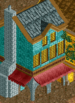
Mattk48: I love the look of those buildings. However, it would be better for a hotel in an mountainous region rather than in a themepark. Keep the station building at most. Redo the others, because it's not a good idea to stick to this style so strictly for a whole area. Moreover, the screen is 50% roof.
If you're making a hotel, which I recommend, you might as well add one or two stories in exactly the same style. I think it will look really sexy with all those balconies.
Good building, wrong use.
Please excuse my tone. I sound like an asshole. -
 Mattk48
Offline
Mattk48: I love the look of those buildings. However, it would be better for a hotel in an mountainous region rather than in a themepark. Redo the others, because it's not a good idea to stick to this style so strictly for a whole area. Moreover, the screen is 50% roof.
Thats a glass half empty situation. the screen is 50 percent awesomeness.
I was thinking of making a design on a mountain with these type of buildings, but i cant get it to look right
also this is a stupid rookie question, but to build things at the same height, i hold control and try to move the the piece. it wont move, am i missing something? it takes alot longer to build stuff when you have to lift each individual piece
 Tags
Tags
- No Tags

