(Archive) Advertising District / Dump-Place
-
 19-April 07
-

 Hepta
Offline
Nah it's not realism fever, at least not from me. I don't even agree with the whole realism-fantasy dichotomy that goes on around here. I just think that the most aesthetic RCT comes from the right intentions. In this case, it most appears that Shotguns? emulated robbie's work, therefore his intention was to emulate. Which goes along with what you're saying FK, shotguns should find his own style. Instead of intending to emulate, he should intend to find his own style and build what he wants.
It doesn't matter whether it's supposedly "realism" or "fantasy". If it's built without a clear intention, it won't look as good as something that was. It could be built with the most complex structure, or the most detailed features, but if there isn't an idea behind it than it just feels...uninspired? I guess that's the best word?
Hey, I might be totally wrong though. This is just the most accurate observation I have from my own experience playing this game, and what I see from others. -
 RCT2day
Offline
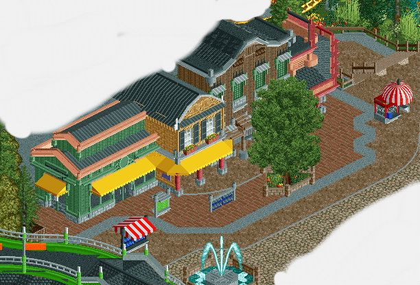
Classy architecture, just change that gray zig-zag path on the right to a diagonal for symmetry and consistency and you'll be golden. Not a fan of the bright green monorail track on the bottom left.
 -

 Louis!
Offline
I love it, it's fantastic. Always been a massive fan of your work. I agree on the path types though. 2 is fine, but 4? bit weird.
 -

 pierrot
Offline
nice details on brown building. btw, I remember many folks were criticized about the path several times, and it never looks good to me either. why do you insist with it?
 -

 Liampie
Offline
Long post, lots of criticism, but that's because I think you can do a lot better.
- The building on the left is very random in its textures and colours. Peach and green is as horrible as the paths.
- The second building is pretty great, except for the colours of the lower part. Yellow doesn't fit and I'd keep red exclusive to the flowers. Also, the roof glitches.
- Third building is truly amazing. Love the dark feel.
- I can't see the fourth building properly but it looks like it has the same problem as the building on the left: generic, random.
It looks like you didn't know what atmosphere you wanted... You've got two really generic buildings, and two prettier buildings that imply a theme. Either go with generic or with themed, preferably the last of course.
Another problem I've got with this screen is the paths. Not just the awkward texture mix, but also the placement of trees, shops and racks. The one tree is massive and blocks the view on the prettiest building, while leaving the rest of the street bare and cold. A row of smaller, thinner trees along the buildings would cover the whole main street, without blocking the view too much, and moreover it implies a direction which is what you want in what has to be a street right after the entrance; it invites the visitor AND the viewer to walk further into the park. Regarding the racks, you can place them more organized, and it should be obvious to which shop they belong. I wouldn't place them in the middle of the street anyway, what if it starts to rain? You can place them inside or under the awning. Don't worry that the paths will be too bare without them because you'll be fine. Especially with peeps and sophisticated placement of benches and lamps. Same goes for the shops. Find a good spot.
You are an unpolished gem. -

 Kumba
Offline
That's a lot of path types, but I think your making it work. I am curious about the green monorail track that seems be over the entrance.
 -

 Nitrous Oxide
Offline
Coupon - I've serisouly come to love your work. You've progressed sooo much. Looks great though man, keep it up!
 -

 Liampie
Offline
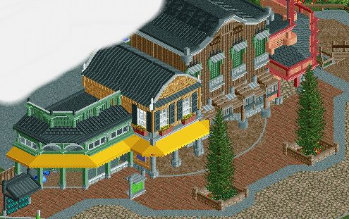
I still think the paths are a mess and a casual sidewalk-street-sidewalk design would look better (because of the straight lines), but overall the screen is an improvement.
 Tags
Tags
- No Tags
