(Archive) Advertising District / Dump-Place
-
 19-April 07
-

 imawesome1124
Offline
The flat is just brilliant, Louis! I think the crazy-paving is fine, but not the light brown.
 -

 FK+Coastermind
Offline
Love the flat, particularly the use of the monorails. Modern incorporation of Trackitecture makes everything looks so clean, i really think it is one of the best things this site has done in the past few years. I do think an accent color of some type would help make it stand out from its surroundings. Maybe the dull red or a dark orange. Just something to make it pop.
FK -

 AvanineCommuter
Offline
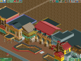
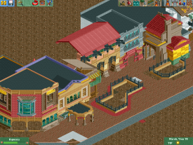
I see the resemblance between shotgun's screens and DCA, but imo it isn't as similar as you guys are making it out to be... Stylistically shotguns is imitating robbie's work, but isn't that what we try to do with the players we look up to? He didn't literally copy building for building like you guys are making it out to be.
And Louis I adore that flat. and that diagonal banner looks fantastic as well.
Edit: in fact, it looks like only the yellow/orange building has direct influences taken from robbie's DCA screen - the chimney detail, roofline, and composition. The other buildings don't ressemble the work in the DCA screen really. -

 Kumba
Offline
The old 'copying' debate huh? imo, Shotguns did not cross a line here, I think this is more his work being influenced by Robbie. I think that's a good thing, just maybe mix in some other styles, so it's less obvious.
Louis, great ride. I agree about the brick walls. They should not be used for walls that thin. The path looks good to me, but the ride really needs some creative themeing. -

 disneylandian192
Offline
Its a tricky situation when a great builder does an existing theme in the best style possible. Everything done in regards to that theme will obviously be attempted to reach that level.. I think Shotguns is innocent for now, but be careful, that line will always be there as you both continue with these projects.
 -

Airtime Offline
You know I love this project. It's a trick task of colouring the surrounding walls and fences around the flat because I've seen you try every colour and path possible and this seems to be the best combination. I think it looks a lot better when the screen is expanded. -

 robbie92
Offline
Shotguns, those colors are nuts, and not in a good way. It's all over the place. Where's the cohesion?
 -

Disney Imagineer Offline
That looks fantastic, Shotguns. I don't like the round red path around your landscape walls, though. I don't think they should be round. But otherwise I think it looks great! -

 robbie92
Offline
Shotguns, there's no discernible theme at the moment. It's just color and details, and none of the buildings seem to fit in with each other. There's not really anything holding them together as a unit, nor is there a reason why they'd all be connected like that. Plus, they don't really seem to look like working buildings, in a lot of ways, just details tacked onto a wall; why would windows be where they are, what's the purpose of each structure? Your work's unreadable unless you have a purpose in mind of what it's going to be before and while you build it. Otherwise, it just seems random.
Matt, as far as me building, I see that happening a lot less; I gotta work on my 2013 resolution for better time management and increased effort in school/health! -

 robbie92
Offline
Oh, Louis, the flat is fantastic, if a bit dull color-wise.
RRP, that screen is amazing, and I can't wait to see what comes from it. -

 Sulakke
Offline
I actually like those colors, Shotguns. They seem to be different and more interesting than the mainstream realistic style.
 -

 Hepta
Offline
Shotguns, there's no discernible theme at the moment. It's just color and details, and none of the buildings seem to fit in with each other. There's not really anything holding them together as a unit, nor is there a reason why they'd all be connected like that. Plus, they don't really seem to look like working buildings, in a lot of ways, just details tacked onto a wall; why would windows be where they are, what's the purpose of each structure? Your work's unreadable unless you have a purpose in mind of what it's going to be before and while you build it. Otherwise, it just seems random.
robbie hit the nail on the head.
Technically, what you've built is superb. The level of detail, variety of color, placement of windows, etc. is all there (just like the new orleans looking screen you posted)
What rob is getting at is that you need to build with an intention other than being detailed. Yeah detail is good, and it is all the rage these days, but detail without intention is meaningless. Your screen is good, and in no way unpleasant to look at. But when I compare yours and rob's side by side, rob's has an entire cohesive feel to it with every building making up that feel. Yours is somewhat more confusing and makes me think, what's the purpose of each building? What's the purpose of the detail on each building? How do these fit into the entire picture?
You've got the technical skill shotguns?, but this is a game of creativity as well />/> I'd love to see you put some serious thought into the detailed building that you do.
-

 pierrot
Offline
he looks like a raw diamond to me, I believe that he'll make something incredible in future.
 -

 FK+Coastermind
Offline
I think what robbie and now Hepta are talking about is a bit of the realism fever taking over. Maybe some of the things are the way they are cause he wants them that way. Sometimes parkmaking is not about doing everything realistically and to the book, but letting what looks best take over what's "realistic".
The difference is, however, this screen is neither. Its to realistic to allow for trivial detail placement to be okay. Yet its got some elements to artistic to be realistic. Which is why, as i said, Shotguns you really need to find your style. I think you have what it takes to be a great parkmaker, but your so busy trying to follow modern conventions and styles. Build soemthing that is 100% you and what you want to do, and finish it. Then you will be able to see exactly what you need to work on.
FK
 Tags
Tags
- No Tags
