(Archive) Advertising District / Dump-Place
-
 19-April 07
-

 Austin55
Offline
UH OH somebody is getting good....
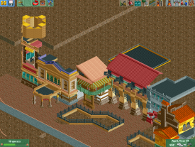
You might be getting a bit aggressive with the detailing and some simplicity might help keep it clean, like the cutting back on the column bases on the building furthest back, and ditching some unnecessary stuff like the 3 window object under the salmon (?) colored roof.
The colors aren't quite hitting the right nerve just yet either, but I'm no good at offering advice on colors.
Also, might be kinda hard now, but you can build bigger to. -

Disney Imagineer Offline
I love that scene shotgun, I think it looks great. No complaints. I especially like your idea of the fenced in landscaped areas. Your columns look great, too. -

 FK+Coastermind
Offline
Shotguns, its a massive improvement from some of your previous work, however, its very clear to see what inspired you. I mean, some of the work can be directly linked to other screens from this topic. Not a problem, but i would warn that improvement is not just showing technical ability, but a style you can claim all your own. Everyone can do super detailed nowadays, what makes ur work different? Thats what you have to find.
FK -

 BelgianGuy
Offline
shotguns that's awesome just remember details need to have function, here it's awesome but now that for a really large park this is impossible to maintain...
as much as I like it some details just don't need to be there and some are missing, I mean the archy is freaking sweet and I know you're still in the raw fase of construction but don't forget about funky little things like carts, signs and other little things that make it all so much better, details on architecture can make a wow factor but a lot of people forget how to make the most used space interesting, the paths... add little carts, add a few quarter tile planters, add like a billboard tower like they have in disney studios and stuff like that, make it so that there's more to view than just the buildings and you'll be golden. -

 chorkiel
Offline
Shotguns it's nice to see you progress so fast but I think you're now at the point where you're detailing for details sake. Like bg said, details need to have a function.
I'll also echo everything else bg already said. -

 Louis!
Offline
Ummmm...isn't that first screen literally Robbie's work?
And then when you look at the second screen you can see where you've added your work to it, because it looks completely different and doesn't look as clean and organised.
So yeah, I'd be impressed, if it actually was your own work. -

 Arjan v l
Offline
Oh my... Shotguns?
Stop showing and start building something, you know.
Your work still impresses me greatly, although, like said by others, don't detail too much.
Try to retain a balance.
You know you're good, it's been said enough. -

 Goliath123
Offline
Haha sorry shotguns i was referencing the buildings themselves, not the entire screen, should of been mroe precise.
 -

 Pacificoaster
Offline
Shotguns, you seem to have recreated much of what Robbie did for DCA. I would commend you if you hadn't stolen almost every structure he had made.
 -

 Pacificoaster
Offline
Not really a fan of the crazy path, nor am i much of a fan of the thin brick walls for the queue, but that flat is ingenious.
 -

 Fizzix
Offline
Crazy paving+light brown isn't the best combination. I think it'd work if you either changed the brown or the path.
 -

 Dimi
Offline
I'd make the fences and brick walls the same kind of brown as te roof, but that flatride is brilliant.
 Tags
Tags
- No Tags


