(Archive) Advertising District / Dump-Place
-
 19-April 07
-

 Pacificoaster
Offline
A few of the things I think about whenever I build a layout is knowing where I am going to put the transfer track, the station, the station stairs, etc. For the case of this station you would have the exit/entrance stairs on the unit directly next to a brake run. The fit just seems to be tight IMO. But each their own I guess.
 -

 Kumba
Offline
I like it Louis, good effort. I tried some things like that on Kumba, but should have expanded on it, mainly on the diagonal breaks where I basically did nothing. Might want to stack some monorail track under the segment for the station. At least on Kumba the track is very deep there in a sort of trench.
 -

 Louis!
Offline
A few of the things I think about whenever I build a layout is knowing where I am going to put the transfer track, the station, the station stairs, etc. For the case of this station you would have the exit/entrance stairs on the unit directly next to a brake run. The fit just seems to be tight IMO. But each their own I guess.
Ummm...doesn't everyone do that? I've done that and know exactly where my transfer track, exit, entrance, queueline etc is going, based completely off the real-life coaster this is inspired by :/ I don't get what's wrong about having a brake-run close to a station. -

 Louis!
Offline
WELL I DONT LIKE YOUR PERSONAL PREFERENCE!!!!111!!
jokes, i've taken into consideration what you've said, but I probably won't change it as i've made things invisible now and can't be bothered to re-do it
-

 Louis!
Offline
The layout seems all over the place and I don't understand all the different tracks :/
 -

Disney Imagineer Offline
I like that, RRP. That's a good lookin' woodie. Not sure how I feel about the giga track, though.
Love that launch (?) into the embankment. Very nice. -

 AvanineCommuter
Offline
That diagonal launch + first hill is almost exactly the same as the layout I made for my solo. I love it!
-

 Mattk48
Offline
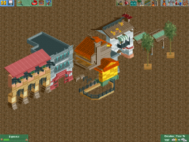
no orange roof, make it the same color green as the kumba roofs. everything else is nice
 Tags
Tags
- No Tags


