(Archive) Advertising District / Dump-Place
-
 19-April 07
-

 Casimir
Offline
dont play LL. keep working on that rct2 thing. really awesome!
Bulls**. Keep playing what you like and out of which you get the most fun. -

 chorkiel
Offline
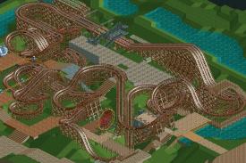
Arjan, the layout looks fine and such. I do think you could better change the ferris wheel. People tend to find themselves enjoying it when they can actually see something from the top of a ferris wheel instead only some wood.
 -

Wicksteed Offline
Bulls**. Keep playing what you like and out of which you get the most fun.
I was just trying to express my amazement for that particular rct2 screen. of course you may play whatever you like, nin. -

 nin
Offline
nin be playing rct2 more years.nin rct2 more better.

The thing with LL is that I have no idea if the stuff I'm building looks good or not (during construction). Louis likes it, RMM not so much. Good + bad = ...decent? -

 Fizzix
Offline
Arjan, I feel like most of those path interactions are pretty forced in, especially the circle of path around the drop. Try letting things flow more, use diagonal paths and don't force interaction where it doesn't belong. If you want decent interaction, it should be a conscious force acting on you while you build, combining layout and surroundings into one.
 -

 Louis!
Offline

a realistic B&M station & brake run, complete with cables, friction wheels and sensors... -

 robbie92
Offline
Yeah, sounds weird coming from me, but it looks too messy/hacked to be all that worthwhile, imo. Still, great idea!
 -

 Pacificoaster
Offline
I would be more concerned about where you are going to put the path for the exit/entrance ramp. For what it's worth, I don't think these details do much of anything for your efforts.
 -

 Louis!
Offline
Eh, it wasn't much effort at all, there wasn't any real hacking involved only making the station invisible, and I think it makes a difference to the shit looking RCT brakes.
Pac - why would I be worried about where to put the path for the entrance and exit ramps? They fit fine :/
 Tags
Tags
- No Tags


