(Archive) Advertising District / Dump-Place
-
 19-April 07
-

 BelgianGuy
Offline
I agree and the scale is actually perfect, those are some really huge ass studios hall man and I think it's pulled off to perfection and remember he'll need the space to theme the inside as it should be themed so I really see him needing all that space...
 -

 Cocoa
Offline
first time I've opened rct to play in... months, at least. just dicking around. I can't be bothered fixing the paint recoloring, I forgot it did that.
-
 ScOtLaNdS_FiNeSt
Offline
Looks really cool. You couldn't be arsed fixing it which i understand but it does ruin it, Really really nice for the first time playing in months a bit rusty but it doesnt show. I don't really get what your going for with the screen but never the less its some good minimal rct. Anyway its a new year. So build some new rct Coco
 -

 Super G
Offline
Not bad, only try to use more different tree colours. Right now it looks a bit monotone. But you look very promissing!
 -

 disneylandian192
Offline
I think Super G's comment is the most prevalent here, switch up the tree types and the colors.
 -

 Mr. Coaster
Offline
Dump!
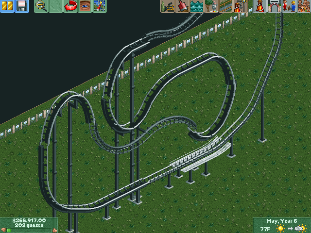
Just fiddling with no hack NCS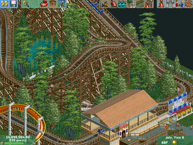
Now how does that work?
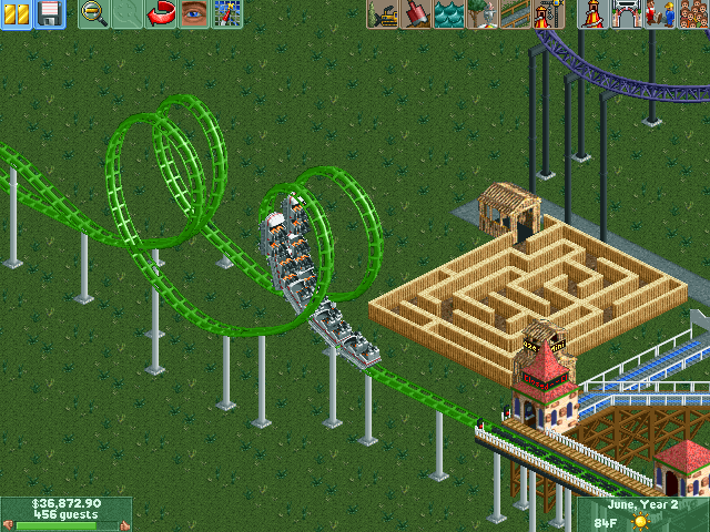
And lastly a few concepts, the Bobsleigh is functional but I need to work on the zacspin.
-

 6crazy6king6
Offline
Very WIP, but I started to station for the first attraction.

Edit: I see that I still need to paint the roof ... -

 disneylandian192
Offline
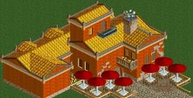
I would take a look at real architecture to try and gain some inspiration. Whether its a phantasy park or an uber realistic project, archy must always be visually pleasing. This hotel above, unfortunately, is not just yet. Be careful with overuse of those fisherman arches too. I don't know what it is about them that when first starting out folks think they need to be on everything (I know I went thru a phase like that at the very beginning also.)
Find your inspiration, do your best to make it visually pleasing with a tasteful color palette and you will go a long way from this screen. -

 Liampie
Offline
Yellows roofs usually look absolutely shit. It doesn't here, which is quite an achievement. Very atmospheric, right amount of detail on the front side. Great balcony placement. BUT!
- 1x2 tower looks horribly out of place
- the whole lower wing is useless and too low to 'connect' to the higher part of the building. It's like two seperate buildings with the lower building built by a lesser architect a century later.
- Random window height - windows in side facade conflict with balcony windows. Think how high each floor is and where the windows would be then
Advice: ditch the lower part, the tower and reposition the windows. A simple L-shape for the building is best here, in my opinion. With the right foliage I'd label it as fantastic. -

 FredD
Offline
You are progressing Xtreme97! I like it a lot, agree on what Liam said. Ditch the lower part, it looks as a fifth wheel.
 -

 Ride6
Offline
I like the 1x2 tower. It's awkwardly charming. I also like the "lower part of the building that was added by a separate architect decades later". It looks that way, but TONs of very real buildings look that way too. It would also make sense if the place functioned as a family home and the family grew too large so they expanded the place before a couple more generations passed and turned it into a restaurant or whatever.
The chimney is grade-A stuff too.
I think you should experiment with adding more of those roof crown / fence bits along the peaks (it's on the bit next to the chimney and nowhere else). Besides that I think you're pretty well off. I'm mostly concerned about the surroundings. Make sure to get plenty of green or rocks or something in there... if that's going to be surrounded by sand the yellow roofs are going to start looking pretty glaring again.
Ride6 -

 disneylandian192
Offline
Took all morning to get them right. Not sure yet what I'm going to do with them.
 Tags
Tags
- No Tags


