(Archive) Advertising District / Dump-Place
-
 19-April 07
-

Rhynos Offline
I understand wanting to convince someone making NCSO stuff to go LL, but if I may, I think the interactions with RCT2 (and SoB/8 Cars) is much easier to deal with than that of LL (and its utilities). This is only my opinion, though. And I never release anything, so take that as you will. -

 chorkiel
Offline
Meh, I was bored and felt like trying ncso.
The thing louis is trying to make, I think, is that mine and s_f screens look like they're trying to impose LL rather than being ncso. Sort of.
Both screens do look like LL a lot and if I had LL I would've defenitely played that instead of ncso. -
 ScOtLaNdS_FiNeSt
Offline
It is inspired by looking at old parks. But i didnt start building this as "try and make it look LL" I was just building randomly and having fun, So i thought i would show you guys how much fun i was having. I have LL but thats installed on my main PC. In the computer room and i was chillin in my room while building so thats one reason i wasnt using LL and another is i have no clue if what i made in rct2 would be harder in LL.
Going by what cocoa said last page because its done in rct2 its all right but if it was done in LL it would be very nice so i take it... that it would be harder.
This fuck about has been done with no 8cars either so fucknows.
Im having fun and will continue to do so
-

 Austin55
Offline
Mav-that's awesome mate. I instantly recognized it. It could deal with being a lot bigger though.
Austin55
Offline
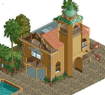
Mav-that's awesome mate. I instantly recognized it. It could deal with being a lot bigger though.The Mission San Martin De La Vega was founded sometime in the late 18th Century. A small town grew around it. Around 1820 it was abandon for nearly 30 years , before the small town was set up on the cattle drives West. The town was taken over with gambling and prostitution in it's many saloons.
-

 Dimi
Offline
Very nice, only the corners of the entrance under the tower look very 'sharp', maybe you can smoothen it up with decoblocks.
 -

 disneylandian192
Offline
Austin, that looks pretty good! Perhaps try using one of the fence edge objects to help fix the sharp edges on the side entrance door.
 -

 Arjan v l
Offline
Shotguns? finish this project of yours this time ,don't half ass it.
Impressive work.
Accolade worthy quality if you ask me. -

Airtime Offline
Love it. I love screens of raw coasters. Look forward to seeing that eventually.Built a little...
Re-imagined...
Nice job, I quite like it. Seems way too like LL though. It has a nice atmosphere as well.Just thought i would jump on the ncso wagon.
"No one knows just how many lives past in the original mansion, but it is for certain that for all those lost , there is a lost soul still in the building. In the Hotel days, Theodore passed away after being struck by a heart attack. He was buried near the front steps. Be sure to leave a Rose by the headstone, or else he may follow you out..."
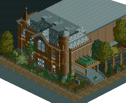
Great architecture! I think the path and the foliage in front of the building is holding the screen back though. Try building the foliage up against the wall epically in any sort of corner and having it line the wall as well, hard to explain but I hope you understand.Mav-that's awesome mate. I instantly recognized it. It could deal with being a lot bigger though.
The Mission San Martin De La Vega was founded sometime in the late 18th Century. A small town grew around it. Around 1820 it was abandon for nearly 30 years , before the small town was set up on the cattle drives West. The town was taken over with gambling and prostitution in it's many saloons.

That's an even better building than the first. Awesome stuff! -

 Austin55
Offline
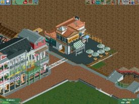
Shotguns-I really like the building in the middle on it's own. The Umbrellas suck though. The row of nawlins building along the left just seem awfully messy. Something about the rooves bother me to, but I cant put my finger on it.
Thanks everyone for your replies to my screens, I have addressed them both accordingly
-

 ScOtLaNdS_FiNeSt
Offline
cheers airtime. If it looks like LL i dont care, Im just having way to much fun.
Another dump worthy screen.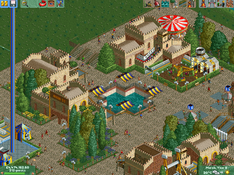
-

 Coupon
Offline
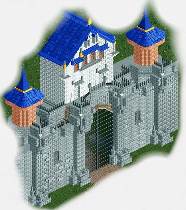
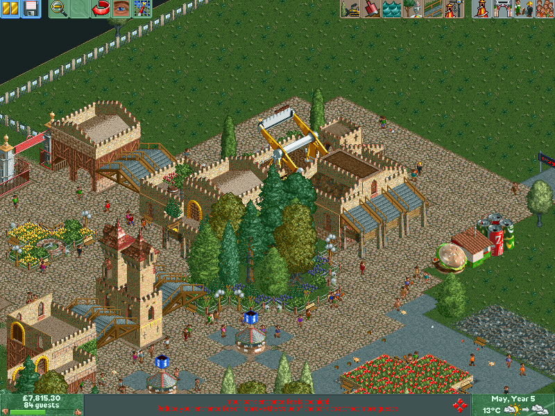
My bad attempt at a castle. I'm not sure if the front windows fit in the windows though.
-

 leonidas
Offline
Well it depends.. If you're going for a Disney castle I think this is too "rough" and big in scale. If you're going for something else, the shape is cool, but you should change the colors.
 -

 BelgianGuy
Offline
the texture of the wall is fine, the other parts need to look less brick and more polished and smooth if you're going disney, also if you're not going disney, try some other colours since these really scream disney in terms of colours so might want to take that into account
 -

 Xtreme97
Offline
That looks great Austin. Though I think you should thicken the arch with some deco pieces.
Coupon, I love the castle but the pillars looks a bit over-detailed.
SF, I think it looks great. Looks like you're having much more fun with it than you are with Goldrush. -

 hulkpower25
Offline
Excellent work Shotgun on those buildings. I really like the cattle, nice details
 Tags
Tags
- No Tags

