(Archive) Advertising District / Dump-Place
-
 19-April 07
-

 nin
Offline
It's a bit repetitive, but it'd look pretty nice as filler architecture.
edit: wow, that last page really was amazing. I've been falling behind. -

 nin
Offline
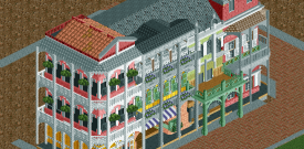
I believe so, yes. I'm particularly fond of the two facades on the left. The roof line is a bit weird, but I don't really think it holds it back.
 -
![][ntamin22%s's Photo](https://www.nedesigns.com/uploads/profile/photo-thumb-221.png?_r=1520300638)
 ][ntamin22
Offline
Another invert?
my thoughts exactly
looks gotham-y. make sure to add dumpsters and bumfights! -

 posix
Offline
FK, you're special and you know it. Not a whole lot to worry about for you.
Robbie, it's nice. Somewhat more relaxed than your recent style which I like. Could use some very subtle height variations here and there perhaps. The flatness of the map comes through a little too much for me.
RMM, I wish the game had those red brick walls natively. Looks very nice. The rest is too haxored for me. -

 gir
Offline
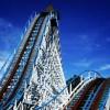
Very cool robbie. My first thought was Top Gun at Carowinds; your screen sort of brought me back to my childhood.
-

 robbie92
Offline
^That's perfect, then. Just what I was going for!
Posix, funnily enough, just outside of the screen, there are elevation changes. This area isn't as flat as the screen makes it out to be. -

RMM Offline
Another invert?
yea, i know, i know. i still have that flyer i showed a while back but i lost motivation. i rarely play anymore and when i do, the invert is the easiest 'interesting' coaster to build. so i opened rct, started to doodle with an invert, fell in love with the layout and i really had a vision for it... so here it stands.
posix, you're my motivation to keep it clean hahaa. -

 Ruben
Offline
Shotguns, it looks really good. Not sure what the theme is supposed to be but it gives off a New Orleans kinda vibe imo.
 -

 disneylandian192
Offline
Robbie, that screen is great! What Posix said is very similar to my feelings. I don't recall who it was who said that your current work is perfect almost to a fault. This screen is a step forward from that. It is a great representation that is fun, realistic, detailed, but not too much so. Looking forward to seeing that in game for sure.
RMM- Fantastic use of the varying brick textures. This screen has a very dark persona, certainly attributed to the extensive use of black. Its screens like this that make me wish I had LL still. -

 robbie92
Offline

Just trying to see if I can make Cedar Fair two-tone B&M track. Colors are merely for testing purposes. -

 Austin55
Offline
I feel like I need to see more of that to get a good feel of it. And probably see it in action. Plans for large loop elements?
 Tags
Tags
- No Tags
