(Archive) Advertising District / Dump-Place
-
 19-April 07
-
 disneylandian192
Offline
i reckon it is a bit short, disneylandian, but otherwise its pretty good. I reckon it certainly resembles the main street in california. that brick texture is actually really good, what is the object called? it looks like a multicolored version of the dark brick wall?
Its a multi-colored 1/4 tile block I made. Thanks for the comments everyone.
Steve: The path is something that has been really killing me too. It ended up way too wide and by the time I really realized it, I already had so much built. I may try to fix it, but it will mean rebuilding the station and the left side of the street just to keep the symmetry.
Coupon: That screen looks great! I've always been a fan of that yellow/blue color combo, and this is no different. The path is a fresh spin and it is refreshingly different. The landscaping looks quite nice too from what I can see in the screen. Definitely looking forward to this release! -

TwistedHelix Offline
Coupon: That looks really nice and clean. As others have said just needs peeps.
RCTER2: I have no idea what that is but bits I find quite charming in it.
~~~~~~~~~~~~~~~~~~~~~~
Just wondering if this is working at all. please ignore the fact that its not finished. Oh and the theme is Piratical in case you hadn't guessed.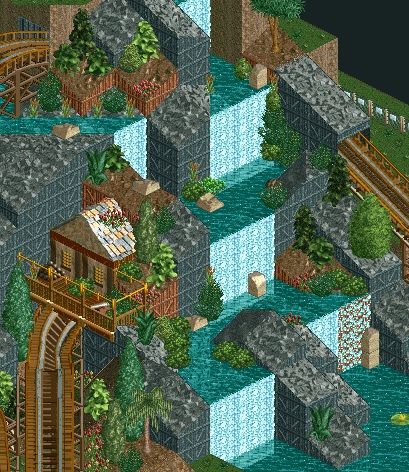
Cheers
TH -

 Xeccah
Offline
Disney, I think if you added some height variations and closed the path by a unit it'll look better. I also think some of the buildings are not well suited for the theme as well.
 -

 Welshcraft
Offline
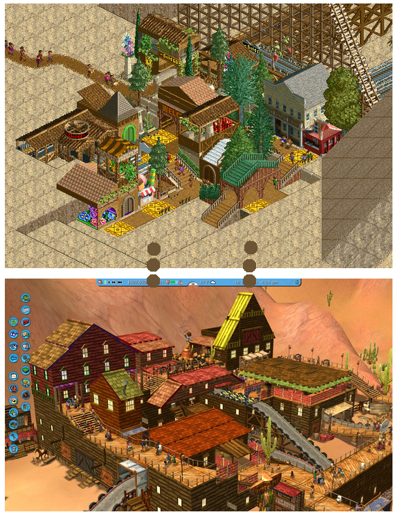
That pic looks like Dynamite Dunes in RCT1 Scenario.
OT: I Built a Arrow Suspended coaster. I nearly finished the station but I am not sure on colors of the track and supports itself. Can you give a feedback and suggest on which color should I use for my track?
-

 Ling
Offline
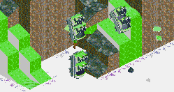
I really don't like the use of a vertical drop, and I think the tiny airtime hill between the zero-G roll and the turnaround is totally unnecessary and out-of-place.
 -
 Xtreme97
Offline
The layout looks a bit strange but it's intriguing. Although there is a severe lack of peep interaction.
 -
 Luketh
Offline
Nice! I'd suggest turning that pale green grass that takes up all of 1/4 of a block to the more lush green color. Hope that makes sense. :S
To improve it a tad more, you could include a few more different tree types, but it seems you've done a good job at keeping variation already. I don't like the presence of the same tree right next to each other on the right side of the screen.
Other than that, you could try to get a bit of color in there somehow; the occasional inclusion of some wildflowers or a berry bush is an easy way to do this. -
 hulkpower25
Offline
i need to make a water ride in the design i am working,and need if any of you could help
 -

 hulkpower25
Offline
rapids would be excellent, but i am not good at all with any water ride. that is the reason i ask somebody who is good with making a good rapid ride
 -

 Xeccah
Offline
rapids would be excellent, but i am not good at all with any water ride. that is the reason i ask somebody who is good with making a good rapid ride
Send me a copy in a few hours hulk, I'm pretty good at water rides.
 Tags
Tags
- No Tags
