(Archive) Advertising District / Dump-Place
-
 19-April 07
-

 Jaguar
Offline
By God, that is cool, I love highrises in RCT. Although I personally despise modernist buildings in real life that is just awesome. I wish it weren't built so close to the map though. If this is an amusement park, make it a futuristic high-tech city instead. That would be great.
 -

RMM Offline
looks great. just a little more practice and your work will look identical to everybody else's. -

 In:Cities
Offline
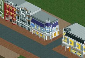
Just trying my hand at recreating Disney main street architecture. In actuality my work rates somewhere as a cross between Midnight Aurora, Cena, and Jesus.
 -

 BelgianGuy
Offline
I agree it's very NE-isch, even for you, also try adding more depth because right now it's very flat in it's facade
 -

RMM Offline
try adding more depth because right now it's very flat in it's facade
... cause they're made in china. -

Wicksteed Offline
looks great. just a little more practice and your work will look identical to everybody else's.
Haha. If I had a quote in my signature, this would be it.
In:Cities - I don't know much about disney, but from how I see you facades they could use a clearer, more contrasted colour scheme. Now you it seems very indistinct. For example the "Arcade" Building is just grayscale plus a bit of brown. -

 disneylandian192
Offline
I like what you've got there. It could surely use some cleaning up and almost looks like detail for detail's sake. Give every building a personality and every scenery piece purpose. Pick a time period and keep to it with your archy. My favorite building is by far the one in the middle with the purple roof, it is clean but well detailed and thought out- definitely the gem of the screen.
Was going to post this in the near future but since you posted Main Street, I might as well too:
-

TwistedHelix Offline
Looks nice disneylandian but there's something off about the red awnings in the middle. They just dont look as nice as the other ones. The tower in the bottom left hand side also looks a little bit flimsy but that might just be the angle.
Just a small shot from the same park as the one I showed one the page before. Was wondering if I should have the brown squares with the brown sided wood (like the ones next tot he house) or have them black like the rest(brown squares above the house)? Its on a mountainside with a waterfall and shit in case that helps.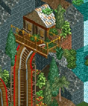
Cheers
TH -

 nin
Offline
disneylandian, the corner building looks a bit short, making the bottom looking really forced. Regardless of accuracy, you should raise it up 1-2 blocks(+), keeping the top level how it is now and remaking the bottom to something much more structurally sound than those flimsy walls.
 -

 Dark_Horse
Offline
Sorry disneylandian, but I just don't see Disney in this. It just seems so bland and sterile.
TwistedHelix, I think you should use black or some other color to give the house more contrast from the wood coaster. -

 Cocoa
Offline
i reckon it is a bit short, disneylandian, but otherwise its pretty good. I reckon it certainly resembles the main street in california. that brick texture is actually really good, what is the object called? it looks like a multicolored version of the dark brick wall?
 -

 Steve
Offline
disneylandian, the skill is prominent and I do like it but the path seems much too wide for Main Street. It doesn't feel cozy or homey at all like the real life counterparts. I do like the blue facade on the far right, though.
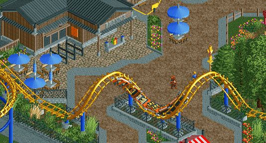
Coupon, real nice! I dislike the brown path but it could just be the angle. Maybe play around with other options. Just plain tarmac might be the way to go. -

 BelgianGuy
Offline
I think the path is indeed a little bit the issue coupon, try playing around with a darker red variation or something like that, something that makes it feel less earthy since the buildings already hint that..
 -

 Turtle
Offline
Don't change the path. It's the only really different thing about the screen. I like it a lot.
 Tags
Tags
- No Tags

