(Archive) Advertising District / Dump-Place
-
 19-April 07
-

 posix
Offline
Nice but very made, custom and overly detaily, thus artificial and sterile, as always.
 -

 Ruben
Offline
Disagree with Posix, I see more life in this than in most of your work.
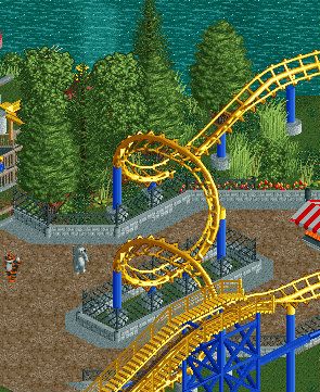
 You need to get those glitches in the walls out though, and maybe rethink those flowers cause those dó look very artificial the way you used them.
But, overall, like it a lot.
-
 RCT2day
Offline
Coupon, there's nothing that I love about it but there's nothing I hate about it. It's just a solid screen. But, like Ruben said, those glitches and flowers damage the natural setting and can be easily fixed. Great job.
 -

 Fizzix
Offline
I think you should try to make the fenced area around the corkscrew more smooth. Right now, you have this really nice organic flowing path and a square fence in the middle of it. So yeah. Looks nice otherwise.
 -

 pierrot
Offline
I'm not trying to demoralize you Coupon but this is what I feel when I saw your work, really can't point out what make this feeling though..Coupon, there's nothing that I love about it but there's nothing I hate about it. It's just a solid screen.
-

 BelgianGuy
Offline
what's wrong with artificial? isn't everything in a park man made? I mean some flower arrangements are artificial as hell and look damn gorgeous in real parks
 -

 Corkscrewy
Offline
Its to big to ne a kiddie coaster and not thrilling enough fir a park. I could definetly Dee this in a zoo though.
-Josh -

 Ruben
Offline
I actually kinda like it for a kiddie kinda woody. Actually reminds me of:
http://rcdb.com/4495.htm
This is one of those cases where surroundings, archy, atmosphere etc. would really need to make the ride. However, if you can pull that off, I'm pretty sure I'd fully disagree with Liampie on this being boring.
However, if you keep it this size you need to get rid of the brake run and maybe condense that last part a bit imo. That track is way too short for 2 trains anyways. -

 Super G
Offline
I actually kinda like it for a kiddie kinda woody. Actually reminds me of:
http://rcdb.com/4495.htm
This is one of those cases where surroundings, archy, atmosphere etc. would really need to make the ride. However, if you can pull that off, I'm pretty sure I'd fully disagree with Liampie on this being boring.
However, if you keep it this size you need to get rid of the brake run and maybe condense that last part a bit imo. That track is way too short for 2 trains anyways.
I will look at this, thanks it's very helpfull. -

 Arjan v l
Offline
Sometimes i hate you.
You're work is always so gorgeous ,so refined....(being jealous here).
How the hell do you always pull it of?
You're good...very good.
 Tags
Tags
- No Tags
