(Archive) Advertising District / Dump-Place
-
 19-April 07
-

 nin
Offline
Then you probably missed the point.I reckon the 'shopping' of this picture took more time than actually stacking those few walls on each other and taking a screen of it.
-

 FK+Coastermind
Offline
i like it, not the "best" thing ive ever seen, but tons of potential for construction, especially from you.
FK -
 Dark_Horse
Offline
I don't like the ending. The hill to the brake run seems forced, which could be because it is RCT. However, I do like the colors.
 -
 disneylandian192
Offline
I like the compactness of the layout. It appears to have good flow but it looks like the trains would be hitting the first loop pretty fast to get enough speed for good pacing the rest of the way.
 -

 Liampie
Offline
Those parallel diagonal parts look really good, makes the layout. The rest is good, but not memorable. Doesn't matter, one memorable part is enough.
 -
 Corkscrewy
Offline
One thing I would try is making the diagonal hill after the immelmann go farther down abd farther away from the core of the ride, which it obviously can do. Maybe till about 5 feet above the ground instead of the 15 it looks like now. And than obviously than you can make the upward right hand turn the larger turns and it might just give it more flow.
-Josh -

 Dark_Horse
Offline
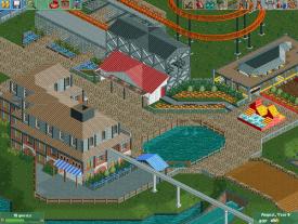
It's certainly an improvement from your previous work mrbuckeye. I kind of enjoy it. Why is the transfer track grey though?
 -
 SixFlagsTexas1994
Offline
^I agree with Dark_Horse that there are several good things about your screen, but at the same time you have soft maroons, browns, and grays on your roofs and buildings... then this weird bright red and yellow sculpture thing plunked in the path center
 -

 Faas
Offline
What is it exactly? I see a rollercoaster and than suddenly a grey and brown building and something red and yellow. What are you making? Is it a theme park?
 Tags
Tags
- No Tags
