(Archive) Advertising District / Dump-Place
-
 19-April 07
-

 disneylandian192
Offline
Not too bad at all! I'd try to find an alternative for the rock wall, I've never seen it look good stacked high before. I think some1/4 tile ruin blocks could help add some organicness and help fight the squareness the left side is developing.
 -

 turbin3
Offline
d-landian: I dislike the trees and I dont see the sense for the high fences around the flowers. Rest looks good
-

 Austin55
Offline
Disney-Kinda feel like were not seeing a whole lot here, its mostly just path and planters which do look nice. I like what you have done on the building, the way you built the rooves around the curved pirate windows is pretty neat.
Turbin-I dislike the huge usage of that ugly rock wall texture on the left side. It looks dirty, regular style bricks with some hedges and rock trim pieces would be better I think. #2 would be the roof, It doesn't look very asian to me, I'd look at some temple rooves and stuff and change those parapets out.
Great screens both of ya'll. -
 Chocotopian
Offline
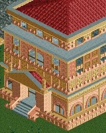
That is excellent! Perhaps the trim around the roof is a tad too thick/tall, but other than that I like it a lot. I think the combination of the pinky and creamy colours seem to blend to give it an overall new colour.
 -

 Louis!
Offline
Great improvement from you Jag, now just apply it to a design or small park.
I cannot stress enough how important it is to release small scale projects to improve. -
 RCT2day
Offline
Jaguarman (or whatever we're calling you), it's great and shows a huge improvement in your work. Why only some red tile over the door rather than none or the whole roof? But seriously, good job and just keep this quality in your parks.
 -

 In:Cities
Offline
Not bad Jaguarprincess, but I think you might have overdone the trimming on the roof a bit!
Take Louis' advice though man. I would love to see a smaller scale project from you, as I honestly think you could win an accolade, as well as improve greatly. Stick to one specific theme, focus, and knock it out of the park:] -

 RCT2day
Offline
Jaguargeezer, listen to Captain Mustache about listening to Louis! (pineapple?) about building a small scale park. You have a lot of potential.
All in good fun.
-

 Ruben
Offline
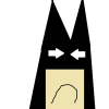
Looks more like Hitler..
Holding a grey dog's head with a mustache.
No but really, good to see you trying sculptures but you're gonna need more detailed (custom) objects to make it work. It's just too blocky and multi-interpretable atm. -

 RCT2day
Offline
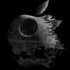
^He's got a point. You never see large statues like these unless it is CS. And even with good CS and exceptional talent, it's hard to pull off well. Still, good to see something different and "out of the box" (pun because it's blocky). Are these the given scenarios?
 -

 RCTER2
Offline
In fact the mustache is the nose.Holding a grey dog's head with a mustache.
No but really, good to see you trying sculptures but you're gonna need more detailed (custom) objects to make it work. It's just too blocky and multi-interpretable atm.
Yes the first is Fungus Woods and the second is Electric Fileds. They are blocky because they are NCSO. I got the inspiration from minecraft^He's got a point. You never see large statues like these unless it is CS. And even with good CS and exceptional talent, it's hard to pull off well. Still, good to see something different and "out of the box" (pun because it's blocky). Are these the given scenarios?

-
 AK Koaster
Offline
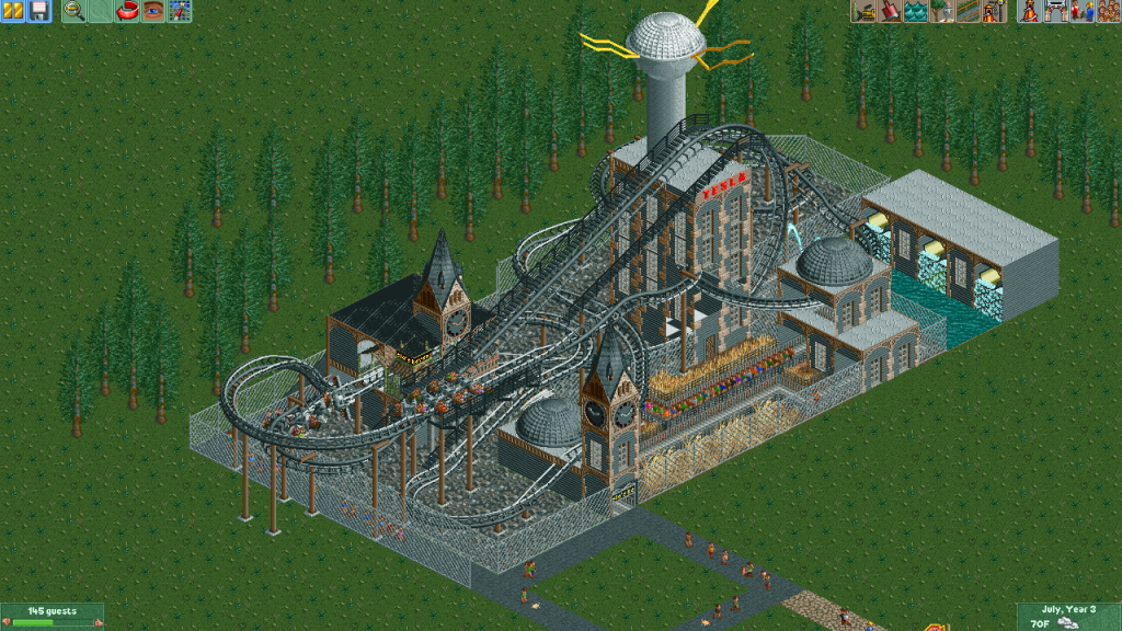
A 4D coaster I built with the stress of finals being over. I call it Tesla's Revenge.
 Tags
Tags
- No Tags

