(Archive) Advertising District / Dump-Place
-
 19-April 07
-

 Ruben
Offline
Ruben, and this goes to many others, too, can't you just like your own stuff? I get frustrated when people won't play unless they get approval from the community. I get it that you kind of play for the site, we all did at some point. And your notion that you won't theme it unless people like it suggests that playing is like an "investment", not so much an enjoyment in itself. But please, try to have more faith and conviction in what you create. I want you to like your stuff. You clicked it together for a reason.
First off, I don't build for the community. Usually I'm very sure/certain about what I like and don't like, as people that have worked with me can probably tell. However, in this specific case I wasn't sure whether this was over the top for realism, or whether it was not. As I really want stuff to be realistic yet likeable I decided to show it. That's more for me than for the community, if I find out something is utterly unrealistic afterwards I will lose interest in the entire project as I'm quite the perfectionist.
For that sake, I love the element to the left, it's my favorite woody helix even though many find it boring.
-

 Arjan v l
Offline
First off, I don't build for the community. Usually I'm very sure/certain about what I like and don't like, as people that have worked with me can probably tell. However, in this specific case I wasn't sure whether this was over the top for realism, or whether it was not. As I really want stuff to be realistic yet likeable I decided to show it. That's more for me than for the community, if I find out something is utterly unrealistic afterwards I will lose interest in the entire project as I'm quite the perfectionist.
For that sake, I love the element to the left, it's my favorite woody helix even though many find it boring.
Then keep it and start working on that design of yours.
-

 Super G
Offline
^ From my limited opinion, I like it.
-------------------
Is this even worth trying to theme?
And is the cork even possible for a flyer?
Have you merged this coasters? Otherwise this isn't even going to wordk. Corkshrews are possible, the loop is not. -

 Liampie
Offline
FK: I love it! Was this lost in the crash?
10ryansmith: the first layout is a nice attempt at the Stingray coaster, but it doesn't flow very well. Plus it's ugly like the real thing. I'd rather see a normal, custom coaster. So much better to look at! The other layout looks lethal. I don't want to know how fast that pretzel is. -

 Ling
Offline
@ 10ryansmith: I like the first layout. Very weird. What's it supposed to be? The second one doesn't really work at all. You can't do big inversions like that on flyers because the G-forces make the trains rattle horribly (see Tatsu and any of the Superman flyers). It's just weird to spend more time on your back than on your stomach on a "flying" coaster.
 -

 FK+Coastermind
Offline
@Liampie-no. while i still have files of alot of things i just lost alot of progress in the crash. Mainly on the design i was working on, which had the big station i loved. i might try to redo it at some point, but right now im exploring some older projects. This design is probably the longest running project i've ever had as it has survived in various stages 3 computer crashes (college is not good for my laptop, but not a problem anymore)
FK -

 ScOtLaNdS_FiNeSt
Offline
Im just interested in the fact your actually building something ruben instead of dishing out criticism. I asked you in PM not so long ago if you had anything going on and you know the answer so im happy to see you at least have a layout.
Its looking pretty cool but yeah that other helix isnt appealing. -

 disneylandian192
Offline
10ryansmith: Not a bad layout, the cork isn't bad. I think it would be better to have the inline twist after the cork continue to the right. Other than that, not bad.
Ruben: I love that middle helix but the turnaround helix needs some work. Perhaps a single helix? -

 gir
Offline
FK, seems like a really nice start. Journey to Atlantis inspired?
On another note, I have to agree with posix. And I'll add that in general, I'm tired of seeing all of these unthemed designs. Yeah, it's the dump place, but I'd still like to see something that took longer than 30 minutes to whip up. Coaster design is obviously an important aspect of RCT, but it's worth nothing if you can't do anything with it. -

 Ruben
Offline
but it's worth nothing if you can't do anything with it.
As is theming you've worked on for hours if the lay-out is going to be changed afterward. If I'd have posted it anywhere else, aye. If I'd built something crap in 10 mins that wasn't supposed to be going anywhere anyways and posted it for fun, aye. But I think if people have a serious question about lay-outs before putting hours of work in the next steps of the process there should be a place to post them, and as far as I know the dump is the only suitable place we have for that.
So yeah, if you don't like it, just scroll over it and don't comment, really I couldn't care less, but give people the chance to get some feedback from those that dó care, will you?
@SF: I fear the main focus will still be on the criticism side of the community for now. But hey, at least I'm trying to get sómething going again after a long time.
-

 FK+Coastermind
Offline
gir, the water ride design is mostly Escape from Pompei inspired, with abit of jorney to atlantis in it. The entire thing is inspired by my Architecture 210 class, just been seeing a ton of ancient and classic archy as of late...
FK -

 gir
Offline
No need to get defensive. Ruben, what I said was not necessarily directed at you, but in general, I'd say have more self-confidence in your design abilities. People don't need the community to validate everything about their project. If there's one aspect you're unsure about, then by all means, ask the community, but there's certainly no need to share the whole layout. To me, when people show the whole layout, the "mystique" is lost, and it makes the release less special.As is theming you've worked on for hours if the lay-out is going to be changed afterward. If I'd have posted it anywhere else, aye. If I'd built something crap in 10 mins that wasn't supposed to be going anywhere anyways and posted it for fun, aye. But I think if people have a serious question about lay-outs before putting hours of work in the next steps of the process there should be a place to post them, and as far as I know the dump is the only suitable place we have for that.
So yeah, if you don't like it, just scroll over it and don't comment, really I couldn't care less, but give people the chance to get some feedback from those that dó care, will you? -

 Liampie
Offline
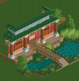
That's some of your best work! Are you sure you want a green roof though? I'm not too keen on it.
 -

 turbin3
Offline
What'd you suggest? It's inspired by Feng Ju Palace from Phantasialand and imo it looks good. I might try another colour / roof type though. Thanks!
 -

 Liampie
Offline
In that case I'll leave it. However, you need a lot of those golden ornaments. And grey for the first floor doesn't look right then.
 -

 Sulakke
Offline
The building looks great, however the suroundings could use some work. I'm not really liking the bridge. It's got something to do with the stairs in front of it I think. It would look better without it if that's possible. I would use normal water instead, with lotuses on top. Also I would recolor the brown tree. And maybe add a gong or something on the terrace, as it is somewhat empty now.
 -

 posix
Offline
Looks nice but it's a little "piece of nothingness" kind of. Don't abandon your macro play man
 Tags
Tags
- No Tags

