(Archive) Advertising District / Dump-Place
-
 19-April 07
-

 BC(rct2)
Offline
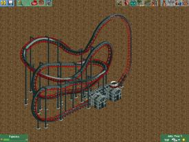
OMG, I always confuse MCBR with the final brakes or whatever it's called. In my eyes this layout doesn't needs that, the speed is well distributed but I'll try to put a MCBR and see if it's really necessary.You keep using that word, but I don't think you know what it means...
@Austin55: this is a B&M hyper coaster. -

 A.S.Coasters
Offline
The MCBR isn't for speed, it's there so that you can dispatch trains faster without them having to wait on the lift hill. It also allows for more trains on one track.
 -

 BC(rct2)
Offline
Thanks for the info!The MCBR isn't for speed, it's there so that you can dispatch trains faster without them having to wait on the lift hill. It also allows for more trains on one track.

-
 Mr. Coaster
Offline
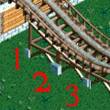
I'm thinking about changing up these footers that I have on my Dinn, and I am looking for a little public opinion. 1 is the style I Currently have. Which do you think is better?
-

 Ruben
Offline
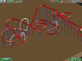
So, just a small question:
The element in the middle, too much/overdone or nice? Would like to know before I start theming.
-
 Arjan v l
Offline
[quote name='Ruben' date='03 November 2012 - 11:19 PM' timestamp='1351981159' post='606499']
So, just a small question:
The element in the middle, too much/overdone or nice? Would like to know before I start theming.
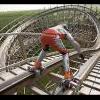
I think it looks good ,perfect for ride interaction ,but i'm not sure about the small spiral on the left. Can't you make that more interesting/exiting? -
 RCT2day
Offline
The middle helix is fine, if not great. But Arjan is right, that helix on the left needs some attention.
 -

 posix
Offline
Ruben, and this goes to many others, too, can't you just like your own stuff? I get frustrated when people won't play unless they get approval from the community. I get it that you kind of play for the site, we all did at some point. And your notion that you won't theme it unless people like it suggests that playing is like an "investment", not so much an enjoyment in itself. But please, try to have more faith and conviction in what you create. I want you to like your stuff. You clicked it together for a reason.
 Tags
Tags
- No Tags
