(Archive) Advertising District / Dump-Place
-
 19-April 07
-

 chorkiel
Offline
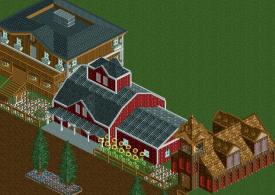
For the building on the left, try to play a little more with the colors. Almost everything is brown.
For the building on the right, try put something under the windows, I don't really know how to explain it but try to have like another texture or just the ploe or w/e under the windows. And also, not every wall needs a window.
I don't know anything about hersched so I might not really get what you're going for though. -

 Arjan v l
Offline
^^ I think i'll agree on that statement.
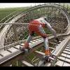
An M.C.B.R. (MID COURSE BRAKE RUN) should be halfway the course (or close to that).
Or the ride is very long ,or the mcbr is nearly at the end of the ride ,judging from the screen. -
 RCT2day
Offline
If those are fish (and they move), then that is incredible. As everyone has said, great colors and land/water interaction.
 -

 That Guy
Offline
My underlying goal was to show the migrational habits of adult salmon.
Thank you all, I changed the support on the left side of the screen because I thought it looked a bit awkward, but I will be starting a topic for this soon, as I am making a lot of progress on this project. -

 Arjan v l
Offline
[quote name='Xtreme97' date='29 October 2012 - 01:51 AM' timestamp='1351471868' post='606073']
Fishes?
I think he used the A&E Piranha attack.
 Tags
Tags
- No Tags


