(Archive) Advertising District / Dump-Place
-
 19-April 07
-

 Midnight Aurora
Offline
...either you don't know what that word means, or you don't know what RMM is saying.horray sarcasm.
-

 Corkscrewy
Offline
Hott damn. I fucking love that layout!! The end might be a little sketchy but damn do I love the rest!!
-Josh
PS that was for rctaddict -

 RctAddict
Offline
2nd screen is bad ass Pacific.....What are the ratings on that 8 inversioned monster?
@Corkscrewy: Thanks, I have 3 different endings so far...if I do the aircraft carrier, I want the end bit to come in for a landing...that's why it's this way for now. -

 Ling
Offline
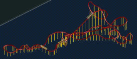
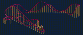
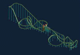
@ Shotguns: The first one is weak and awkward in places, but I like the second one quite a bit. I take it the last one is a stand-up layout? I like the more original take on the second half. The first half makes me think of what we would get if Mantis knocked up Georgia Scorcher.
@ Pacificoaster: I love them both. The little hump at the end of the hyper should be a dip though, I think. -

 AvanineCommuter
Offline
@ shotguns: I like the first two elements in the first layout, then the rest kind of bombs. 2nd and 3rd layouts are not bad.
@pacificoaster: First layout is boring but to me most hyper coasters have really boring layouts. The second layout looks really good, I love the flow of it all. -

 FK+Coastermind
Offline
^^^not quiet alpengeist, though similar features.
Pac, i like this design, though it has 2 big issues for me. 1, im not a fan of the loop at the end particularly because its after the set of corkscrews. Im all for unconventional, but somehow as much as i want to embrace this, it just looks weird.
My bigger issue is its too compact. Is it a design or 1 of many coasters in a park? as of right now, ur gonna end up with such little peep-coaster interaction because everything is overshadowed by the spectacular yet clumped elements of the coaster. If the coaster was smaller it wouldn't be a problem, but as its so big, it needs landscape and peep interaction. I think you should take these elements and the smooth layout yet spread it out so each element can stand on its own rather than a jumbled park of the whole. As a result you will have more direction for peep and landscape interaction and a design that is stellar. i know i sound harsh, but i think this is something that could sincerely help ur design making process. It's the one thing DAW lacked, interaction between the peeps and the rides. Hit that, and i think you will progress beyond all others.
FK -

 Louis!
Offline
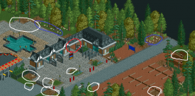
So yea i recently started to play RCT again after a period of 2 years. I'm still getting used to building again and this is what came out. I know there is a wall missing
 and it's not finished.
This is brilliant.
 Tags
Tags
- No Tags

