(Archive) Advertising District / Dump-Place
-
 19-April 07
-

 BC(rct2)
Offline
Thanks to you two! I had a big help from Arjan, he did almost every scenery. I did the layout with a little touch from Arjan, and I did some scenery too. *I'm finishing this project (:
 -

 Ling
Offline
@ Croustibapt: I don't really get why you've used what appear to be offset quarter-tile connectors instead of half-tile ones that would actually like up with the track... Also, all the glitching makes me think that many of your supports are one clearance too low to go with the track, while the ones on the lift are way too high. I like what I can see of the layout.
@ BC(rct2): I pretty much like it all except for the extremely organized grass in the first screen, and the waterfall straight onto rock with no splash or white water or anything (also in the first screen). -

 imawesome1124
Offline
Experimentation. Trying to improve my architecture and foliage, which both really need improving. This will be for a Herschend park which will be part of a 3 map project. The other 2 maps will be a water park (non-functioning, sorry) and a cabin resort. This is not the actual park yet, just experimentation.
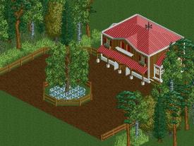
Please give me feedback. -

 WhosLeon
Offline
The building looks nice, but i recommend you to build a bit less symetrical. If you make your path shapes more organic the total picture will look a lot better and less boring.
To improve your foilage i'd suggest to make groups of trees instead of just trees put everywhere, and make small groups of flowers/ toadstools in them. -

 Mr. Coaster
Offline
Shambahala inspired a little I'm guessing? I like what I see, though i think the concrete looks a bit odd, maybe if you were to lower it slightly? And i think the whole screen would look better if you were to put some long grass in the empty spots, to make it look a little more natural.
 -

 Fizzix
Offline
That's such a hard element to recreate in game, but I think you've done it justice. lol at corner edits to compensate for unfinishedness.
 -

 Ling
Offline
It's not unfinished, I just wanted the gradient. But it's just foliage around this part, so there's not much to see.
I didn't want to over-do it on the underbrush so I've mostly confined it to the trees. And no, I wasn't really thinking of Shambhala when I made it. I wouldn't try recreating that ampersand to save my life. I just wanted a turnaround that was a little more vertical.
It would be difficult to lower the concrete, because then it would either have to follow the full-tile land grid, or I would have to randomly color all the land around there with dirt since the only grass-textured quarter-tile land objects are flat ones. -

 FK+Coastermind
Offline
U have done a good job recreating that element, I just don't think that element looks pretty in rct. It can't really be done the same way, and while this looks close, it also looks awkward in shape. It's like 95 degree drops in rct, they can be done with ugly reverse track shit, but they end up looking just wrong. That's my opinion anyway, otherwise I like what I see
FK -

 Ling
Offline
Looks close to what? The Shambhala ampersand? I'm not trying to recreate it. It's just a helix.
Thanks though. -

 Turtle
Offline
That's a really beautiful element. The surroundings just look a little boring at the moment..
 -

 Louis!
Offline
I like it, I dont like the grey flanges though, would look better red IMO. But the turnaround is pretty, although does it look ugly from other views?
 -

 Casimir
Offline
That's a beautiful interpretation of that element!
Maybe try to add some subtle, flat border pieces onto that cement area? -

 Ling
Offline
I'm working on bringing the foliage in closer to the ride as others have suggested, but I don't want to get too crazy. I'm trying the mimic the kind of area an amusement park might be built in here in Montana (expansive, flat, lots of scattered trees with interspersed open space).That's a really beautiful element. The surroundings just look a little boring at the moment..
Of course it does, it's RCT.I like it, I dont like the grey flanges though, would look better red IMO. But the turnaround is pretty, although does it look ugly from other views?
Thanks. And you mean like the roof trim deco pieces?That's a beautiful interpretation of that element!
Maybe try to add some subtle, flat border pieces onto that cement area? -

 WhosLeon
Offline
So yea i recently started to play RCT again after a period of 2 years. I'm still getting used to building again and this is what came out. I know there is a wall missing
 and it's not finished.
-

 BC(rct2)
Offline
Thanks, I'll work on that@ BC(rct2): I pretty much like it all except for the extremely organized grass in the first screen, and the waterfall straight onto rock with no splash or white water or anything (also in the first screen).

 Tags
Tags
- No Tags


